Hi, we are going to talk about the Grid. To understand the Grid CSS method of styling contents, we would need an example to see how it works. So, to do this I am going to setup my Index.html and index.css files.
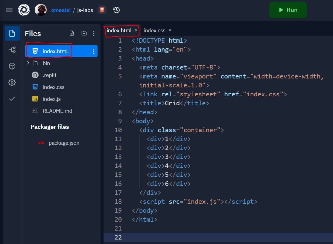
#1. Let's create the Index.html file.
<!DOCTYPE html>
<html lang="en">
<head>
  <meta charset="UTF-8">
  <meta name="viewport" content="width=device-width, initial-scale=1.0">
  <link rel="stylesheet" href="index.css">
  <title>Grid</title>
</head>
<body>
  <div class="container">
    <div>1</div>
    <div>2</div>
    <div>3</div>
    <div>4</div>
    <div>5</div>
    <div>6</div>
  </div>
  <script src="index.js"></script>
</body>
</html>
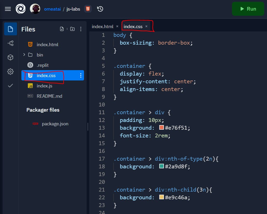
#2. Next, let's create our basic Index.css file. We will use flexbox to align our div boxes into a single row.
body {
  box-sizing: border-box;
}

.container {
  display: flex;
  justify-content: center;
  align-items: center;
}

.container > div {
  padding: 10px;
  background: #e76f51;
  font-size: 2rem;
}

.container > div:nth-of-type(2n){
  background: #2a9d8f;
}

.container > div:nth-child(3n){
  background: #e9c46a;
}
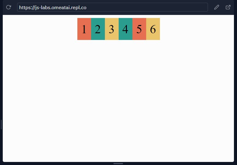
#3. So, our output will look like this.
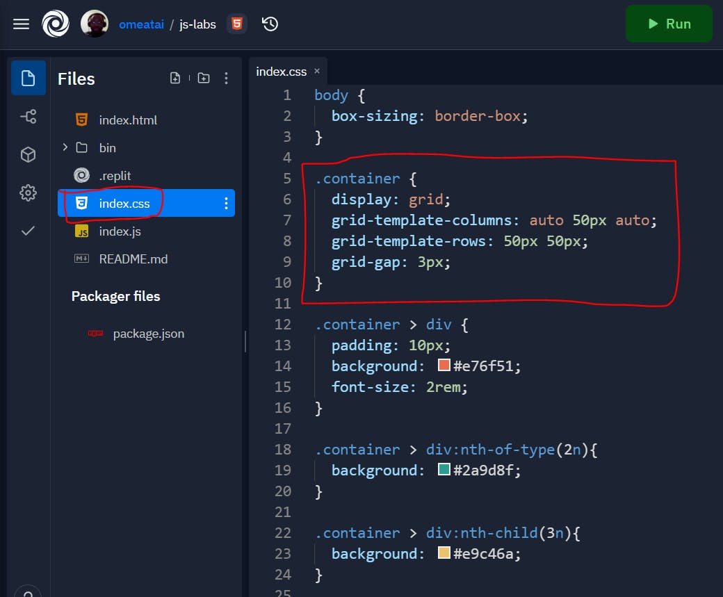
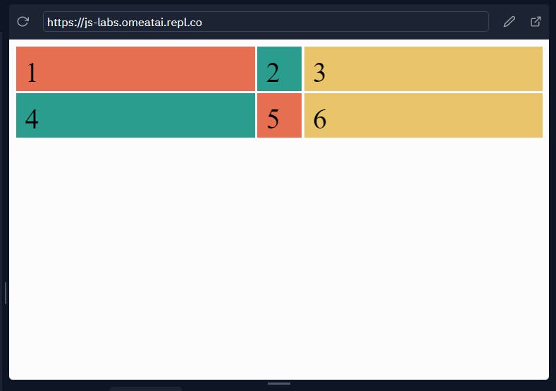
#4. Next, let's include our grid changes to make the divs align to 2 rows and 3 columns and to make sure it stretches to the end margins on both sides. To do this, I will have to replace the flexbox properties in the "container" class with the grid properties.
body {
  box-sizing: border-box;
}

.container {
  display: grid;
  grid-template-columns: auto 50px auto;
  grid-template-rows: 50px 50px;
  grid-gap: 3px;
}

.container > div {
  padding: 10px;
  background: #e76f51;
  font-size: 2rem;
}

.container > div:nth-of-type(2n){
  background: #2a9d8f;
}

.container > div:nth-child(3n){
  background: #e9c46a;
}
#5. Our output will now look like this.
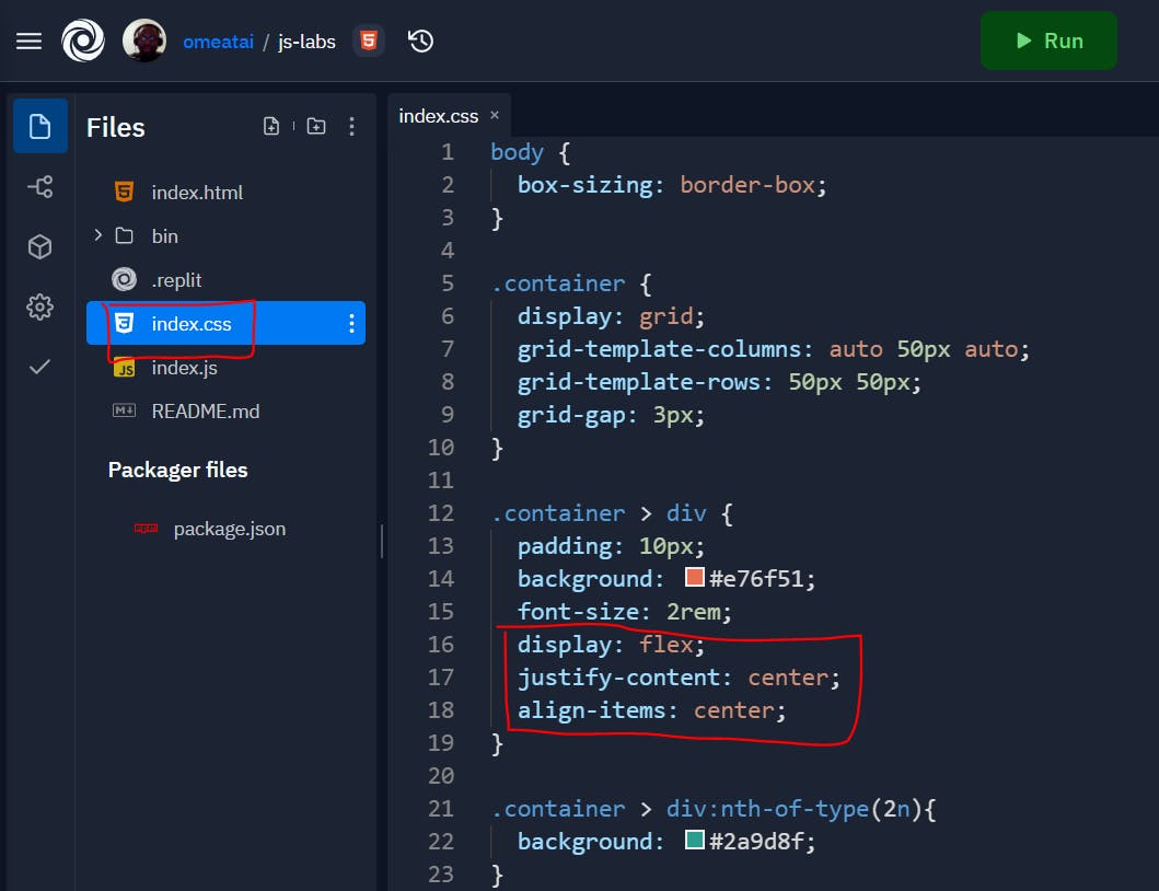
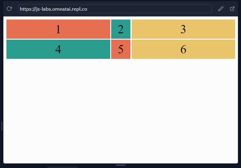
#6. Let's now use flexbox to center align the numbers within the div boxes.
body {
  box-sizing: border-box;
}

.container {
  display: grid;
  grid-template-columns: auto 50px auto;
  grid-template-rows: 50px 50px;
  grid-gap: 3px;
}

.container > div {
  padding: 10px;
  background: #e76f51;
  font-size: 2rem;
  display: flex;
  justify-content: center;
  align-items: center;
}

.container > div:nth-of-type(2n){
  background: #2a9d8f;
}

.container > div:nth-child(3n){
  background: #e9c46a;
}
#7. Our output will now look like this.
Conclusion
The Grid CSS styling method is quite similar to the Flexbox or third-party bootstrap method, but it seems to be much more simplistic and easier to use. It has also gained massive adoption among many browsers and I would definitely recommend you try it out and see if it's best for you!
#End
Hope you enjoyed this! :) Follow me for more contents...
Get in Touch:
ifeanyiomeata.com
contact@ifeanyiomeata.com
Youtube: youtube.com/c/IfeanyiOmeata
Linkedin: linkedin.com/in/omeatai
Twitter: twitter.com/iomeata
Github: github.com/omeatai
Stackoverflow: stackoverflow.com/users/2689166/omeatai
Hashnode: hashnode.com/@omeatai
Medium: medium.com/@omeatai
© 2021

