HTML (HyperText Markup Language) is the most fundamental component of the Internet. It establishes the structure and meaning of web content. HTML5 is the updated version of HTML and it adds some new HTML tags that are more descriptive.
Here are the basic HTML5 tags and features:1. Head
2. Body
3. Title
4. Header
5. Main
6. Footer
7. Nav
8. Article
9. Section
10. Aside
11. Video
12. Embed
13. Audio
14. Image
15. Anchor
16. Paragraph
17. Division
18. Span
19. Ul
20. Ol
21. Details
22. Datalist
23. Progress
24. Radio
25. Checkbox
26. Figure and Figcaption
27. Text
28. Password
29. Email
30. Tel
31. Checkbox
32. Radio
33. File
34. Hidden
35. Button
36. Submit
37. Reset
38. Search
39. Number
40. Range
41. Url
42. Color
43. Image
44. Date
45. Datetime-local
46. Time
47. Week
48. Month
49. Fieldset and Legend
50. Table
51. Accesskey
52. Tabindex
The HTML5 Template:
<!DOCTYPE html>
<html lang="en">
    <head>
        <meta charset="UTF-8" />
        <meta http-equiv="X-UA-Compatible" content="IE=edge" />
        <meta name="viewport" content="width=device-width, initial-scale=1.0" />
        <title>Document title</title>
    </head>
    <body>
        <header class="myheader">
            <img src="./myLogo.png" alt="Logo" />
            <h1>Ifeanyi's Blog!</h1>
        </header>
        <nav class="menu">
            <ol>
                <li class="home"><a href="#">Home</a></li>
                <li class="about"><a href="#">About Me</a></li>
                <li class="contact">Contact</li>
            </ol>
        </nav>
        <main class="mycontent">
            <h1>Hello World</h1>
            <p>Hello Paragraph</p>
            <article>
                <h2>Lorem ipsum</h2>
                <p>Lorem ipsum dolor sit amet.</p>
            </article>
        </main>
        <footer>
            <p>© 2021. Ifeanyi Omeata.</p>
        </footer>
    </body>
</html>
1. Head
>>Return to Menu
Machine-readable information (metadata) about a HTML document like its title, scripts, and style sheets, are contained in the head HTML element.
<head>
    <meta charset="UTF-8">
    <meta http-equiv="X-UA-Compatible" content="IE=edge">
    <meta name="viewport" content="width=device-width, initial-scale=1.0">
    <title>Document title</title>
</head>
2. Body
>>Return to Menu
The content of an HTML document is represented by the body HTML element. In a document, there can only be one body element.
    <body>
        <header class="myheader">
            <img src="./myLogo.png" alt="Logo" />
            <h1>Ifeanyi's Blog!</h1>
        </header>
        <nav class="menu">
            <ol>
                <li class="home"><a href="#">Home</a></li>
                <li class="about"><a href="#">About Me</a></li>
                <li class="contact">Contact</li>
            </ol>
        </nav>
        <main class="mycontent">
            <h1>Hello World</h1>
            <p>Hello Paragraph</p>
            <article>
                <h2>Lorem ipsum</h2>
                <p>Lorem ipsum dolor sit amet.</p>
            </article>
        </main>
        <footer>
            <p>© 2021. Ifeanyi Omeata.</p>
        </footer>
    </body>
3. Title
>>Return to Menu
The title HTML element specifies the document's title, which appears in the title bar of a browser or in the tab of a page. Tags within the element are ignored, therefore it simply includes text.
<title>Document title</title>
4. Header
>>Return to Menu
The HTML header element often contains a collection of introductory and navigational elements such as some heading components, logo, search form, author name, and certain other relevant rinformation.
<header class="myheader">
       <img src="./myLogo.png" alt="Logo" />
       <h1>Ifeanyi's Blog</h1>
</header>
5. Main
>>Return to Menu
The prominent component of a document's body is represented by the main HTML element. The main content area contains content that is directly related to or expands upon a document's theme or functionality.
<main class="mycontent">
    <h1>Hello World</h1>
    <p>Hello Paragraph</p>
    <article>
        <h2>Lorem ipsum</h2>
        <p>Lorem ipsum dolor sit amet.</p>
    </article>
</main>
6. Footer
>>Return to Menu
The HTML footer element comprises information about the section's author, copyright information, or links to related articles.
<footer class="myfooter">
    <p>© 2021. Ifeanyi Omeata.</p>
</footer>
7. Nav
>>Return to Menu
The nav> HTML element designates a portion of a page that contains navigation links, either within the current document or to other documents. Menus, tables of contents, and indexes are all examples of navigation sections.
<nav class="menu">
    <ol>
        <li class="home"><a href="#">Home</a></li>
        <li class="about"><a href="#">About Me</a></li>
        <li class="contact">Contact</li>
    </ol>
</nav>
8. Article
>>Return to Menu
A self-contained composition in a document, page, application, or site that is meant to be independently distributable or reusable is represented by the HTML article element. Examples of article contents include a forum post, a magazine, a newspaper article, a blog entry, a product card, a user-submitted comment, an interactive widget, and any other standalone piece of content.
<article>
    <h2>Lorem ipsum</h2>
    <p>Lorem ipsum dolor sit amet.</p>
</article>
9. Section
>>Return to Menu
The section HTML element represents a generic independent portion of a document that is not represented by a more specific semantic element. It is recommended for sections to always have a heading.
<section>
    <h2>Introduction</h2>
    <p>Lorem ipsum dolor sit amet, consectetur adipiscing elit, sed do eiusmod tempor incididunt ut labore et dolore magna aliqua.</p>
</section>
10. Aside
>>Return to Menu
The HTML element aside denotes a section of a document whose content is only tangentially related to the main content. Sidebars or call-out boxes are common ways to present asides.
<p>Lorem ipsum dolor sit amet, consectetur adipiscing elit.</p>

<aside>
    <p>Lorem ipsum dolor sit amet, consectetur adipiscing elit.</p>
</aside>

<p>Lorem ipsum dolor sit amet, consectetur adipiscing elit, sed do eiusmod.</p>
11. Video
>>Return to Menu
The HTML video element inserts a media player that allows video playback into the document. Although you can use the video element for audio material, the audio element may give a better user experience.
First Method:
<video controls width="620" src="https://archive.org/download/BigBuckBunny_124/Content/big_buck_bunny_720p_surround.mp4" poster="https://peach.blender.org/wp-content/uploads/title_anouncement.jpg?x11217">
Sorry, your browser doesn't support embedded videos.
</video>
Second method:
<video controls width="620">
     <source type="video/webm" src="https://archive.org/download/BigBuckBunny_124/Content/big_buck_bunny_720p_surround.mp4" poster="https://peach.blender.org/wp-content/uploads/title_anouncement.jpg?x11217">
     <source type="video/mp4" src="https://archive.org/download/BigBuckBunny_124/Content/big_buck_bunny_720p_surround.mp4" poster="https://peach.blender.org/wp-content/uploads/title_anouncement.jpg?x11217">
     Sorry, your browser doesn't support embedded videos.
</video>
12. Embed
>>Return to Menu
The HTML embed element inserts external content at a specific location in the document. An external application or other source of interactive media, such as a browser plug-in, provides this content.
<embed type="video/webm" src="/media/mysong.mp4" width="250" height="200">
13. Audio
>>Return to Menu
The HTML element audio is used to embed audio material in documents. It may have one or more audio sources, which are represented by the src attribute or the source element, with the browser selecting the best one.
First Method:
<figure>
    <figcaption>Listen to the Audio:</figcaption>
    <audio id="myaudio" controls>
      <source src="audio/myaudio.mp3" type="audio/mpeg">
      <source src="audio/myaudio.ogg" type="audio/ogg">
      Your browser does not support the <code>audio</code> element.
     </audio>
</figure>
Second Method:
<figure>
    <figcaption>Listen to the Audio:</figcaption>
    <audio id="myaudio" controls src="audio/myaudio.mp3">
            Your browser does not support the <code>audio</code> element.
    </audio>
</figure>
14. Image
>>Return to Menu
The img element can be used to add images to your website, and the src attribute can be used to point to a specific image's URL. An alt attribute is required for all img elements. Screen readers use the text inside an alt attribute to assist accessibility, and it is displayed if the image fails to load.
<img src="https://www.myweb.com/your-image.jpg" alt="My web Image.">
15. Anchor
>>Return to Menu
You can utilize the anchor tag to connect to content that is not on your page. An href attribute is required for an anchor element to have a destination web address.
<a href="https://www.myweb.org" target="_blank>This links to myweb.org</a>
Internal links can also be created using anchor elements to navigate to different portions of a webpage. To make an internal link, set the href attribute of a link to a hash symbol (#) followed by the value of the id attribute for the element you wish to connect to, which is normally farther down the page. For example:
Internal link:
<a href="#contacts">Contact Us</a>
Linked element:
<h2 id="contacts">Contact Form</h2>
16. Paragraph
>>Return to Menu
A paragraph is represented by the HTML p element. In visual media, paragraphs are typically portrayed as blocks of text separated by blank lines and/or first-line indentation, whereas HTML paragraphs can be any structural grouping of related material, such as photos or form fields.
<p>Lorem ipsum dolor sit amet, consectetur adipiscing elit.</p>
17. Division
>>Return to Menu
The HTML div element is used to create a general container for flow content. Unless it's styled with CSS, it has no effect on the content or layout.
<div class="mydiv">
    <img src="photo.jpg" alt="An Image.">
    <p>Lorem ipsum dolor sit amet, consectetur adipiscing elit.</p>
</div>
18. Span
>>Return to Menu
The HTML span element is a general inline container for structuring text that does not represent anything by itself. It can be used to style elements by grouping them together.
<p>Lorem ipsum dolor <span class="myspan">sit amet</span> , consectetur adipiscing elit.</p>
19. Ul
>>Return to Menu
An unordered list of elements is represented by the HTML ul element, which is commonly shown as a bulleted list. The HTML li element is used to denote a list item. An ordered list (ol>) or an unordered list (ul>) must have it as a parent element.
<ul>
    <li>Apple</li>
    <li>Orange
        <ul>
            <li>Blueberries</li>
            <li>Banana</li>
        </ul>
    </li>
</ul>
20. Ol
>>Return to Menu
An ordered list of items is represented by the ol HTML ol element, which is commonly rendered as a numbered list. The HTML li element is used to denote a list item. An ordered list (ol>) or an unordered list (ul>) must have it as a parent element.
<ol>
  <li>Apple</li>
  <li>Mango</li>
  <li>Banana</li>
</ol>
21. Details
>>Return to Menu
The HTML details element produces a widget that only shows information when the widget is toggled to the "open" state. It contains the HTML summary element which specifies a summary, caption, or legend for the disclosure box of the element. The parent element is toggled open and closed when the summary element is clicked.
<details>
    <summary>I have keys but no doors. I have space but no room. You can enter but can’t leave. What am I?</summary>
    A keyboard.
</details>
22. Datalist
>>Return to Menu
The HTML datalist element comprises a set of option elements that reflect the acceptable or suggested alternatives that can be selected from within other fields.
<label for="choice">Choose a color:</label>
<input list="colors" id="choice" name="choice" />
<datalist id="colors">
    <option value="Red">
    <option value="Blue">
    <option value="White">
    <option value="Yellow">
    <option value="Pink">
</datalist>
23. Progress
>>Return to Menu
The HTML progress element shows a progress indicator for a task, which is commonly shown as a progress bar.
<label for="download">Download progress:</label>
<progress id="download" max="100" value="70"> 70% </progress>
24. Radio
>>Return to Menu
Radio buttons can be used for queries where you simply want the user to choose one choice from a list of several. You can nest each of your radio buttons within its own label element. Wrapping an input element inside a label element causes the radio button input to be automatically associated with the label element that surrounds it.
<h2>Select a place to go:</h2>
<form action="#">
        <label for="lagos">
                <input type="radio" id="lagos" name="place" />
                Lagos
        </label>
        <label for="abuja">
                <input type="radio" id="abuja" name="place" />
                Abuja
        </label>
        <label for="kaduna">
                <input type="radio" id="kaduna" name="place" />
                Kaduna
        </label>
</form>
25. Checkbox
>>Return to Menu
Checkboxes are widely used in forms for inquiries with multiple answers. You can nest each of your checkboxes within its own label element. Wrapping an input element inside a label element causes the checkbox input to be automatically associated with the label element that surrounds it.
<h2>Select personality:</h2>
<form action="#">
        <label for= "happy">
            <input type="checkbox" id="happy" name="personality"/>
            Happy
        </label>
        <label for= "sad">
            <input type="checkbox" id="sad" name="personality"/>
            Sad
        </label>
        <label for= "Joyful">
            <input type="checkbox" id="Joyful" name="personality"/>
            Joyful
        </label>
</form>
The checked attribute can be used to make a checkbox or radio button checked by default. Simply add the term checked to the inner of an input element to accomplish this.
<label for= "happy">
       <input type="checkbox" id="happy" name="state" checked/>
       Happy
</label>
<label for= "yellow">
       <input type="radio" id="yellow" name="color" checked>
       Yellow
</label>
26. Figure and Figcaption
>>Return to Menu
<figure>
  <img src="roundhouse.jpeg" alt="Photo of roundhouse">
  <br>
  <figcaption>
    Roundhouse Building viewed from above.
  </figcaption>
</figure>
#27. Text
>>Return to Menu
<input type="text">
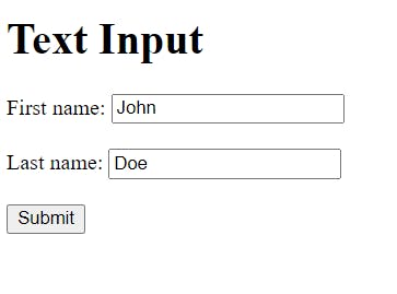
The Text Input defines a single-line text field, with the default width of 20 characters for the text field.
<h1>Text Input</h1>
<form action="/process.php">
  <label for="fname">First name: </label>
  <input type="text" id="fname" name="fname"><br><br>
  <label for="lname">Last name: </label>
  <input type="text" id="lname" name="lname"><br><br>
  <input type="submit" value="Submit">
</form>
#28. Password
>>Return to Menu
<input type="password">
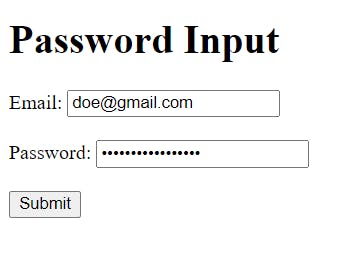
The password Input masks all characters that are entered as a way of providing additional password security from preying eyes.
<h1>Password Input</h1>
<form action="/process.php">
  <label for="email">Email:</label>
  <input type="email" id="email" name="email"><br><br>
  <label for="pwd">Password:</label>
  <input type="password" id="pwd" name="pwd" minlength="6"><br><br>
  <input type="submit">
</form>
#29. Email
>>Return to Menu
<input type="email">
The Email Input defines a field for an email address, and the value is validated to ensure it is properly formatted as an email address. This email input below allows only one email address to be sent:
<h1>Email Input</h1>
<form action="/process.php">
  <label for="email">Enter your email:</label>
  <input type="email" id="email" name="email">
  <input type="submit">
</form>

But, this example below allows multiple email addresses to be sent:
<h1>Email Input(multiple)</h1>
<form action="/process.php">
  <label for="emails">Enter email addresses:</label>
  <input type="email" id="emails" name="emails" multiple>
  <input type="submit">
</form>

#30. Tel
>>Return to Menu
<input type="tel">
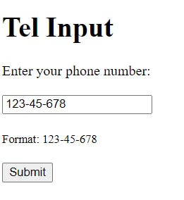
The field for entering a phone number is defined by the tel Input.
<h1>Tel Input</h1>
<form action="/process.php">
  <label for="phone">Enter your phone number:</label><br><br>
  <input type="tel" id="phone" name="phone" placeholder="123-45-678" pattern="[0-9]{3}-[0-9]{2}-[0-9]{3}" required><br><br>
  <small>Format: 123-45-678</small><br><br>
  <input type="submit">
</form>
#31. Checkbox
>>Return to Menu
<input type="checkbox">
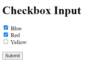
Checkboxes allow a user to pick one or more alternatives from a restricted set of possibilities.
<h1>Checkbox Input</h1>
<form action="/process.php">
  <input type="checkbox" id="vehicle1" name="vehicle1" value="Bike">
  <label for="vehicle1"> Blue</label><br>
  <input type="checkbox" id="vehicle2" name="vehicle2" value="Car">
  <label for="vehicle2"> Red</label><br>
  <input type="checkbox" id="vehicle3" name="vehicle3" value="Boat">
  <label for="vehicle3"> Yellow</label><br><br>
  <input type="submit" value="Submit">
</form>
#32. Radio
>>Return to Menu
<input type="radio">
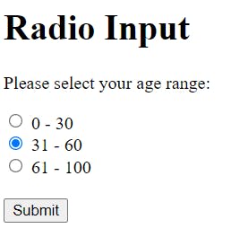
Radio Inputs are provided in radio groups where only one radio button may be selected at a time.
<h1>Radio Input</h1>
<form action="/process.php">
  <p>Please select your age range:</p>
  <input type="radio" id="age1" name="age" value="30">
  <label for="age1">0 - 30</label><br>
  <input type="radio" id="age2" name="age" value="60">
  <label for="age2">31 - 60</label><br>
  <input type="radio" id="age3" name="age" value="100">
  <label for="age3">61 - 100</label><br><br>
  <input type="submit" value="Submit">
</form>
#33. File
>>Return to Menu
<input type="file">
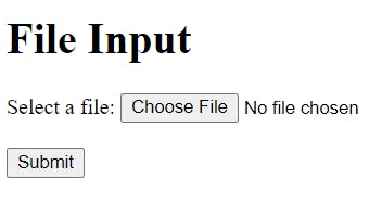
For file uploads, File Input defines a file-select field and a "Browse" button.
<h1>File Input</h1>
<form action="/process.php">
  <label for="myfile">Select a file:</label>
  <input type="file" id="myfile" name="myfile"><br><br>
  <input type="submit">
</form>
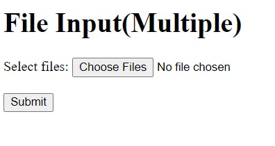
For multiple file uploads, we would add the multiple attribute:
<h1>File Input(Multiple)</h1>
<form action="/process.php">
  <label for="myfile">Select files:</label>
  <input type="file" id="myfile" name="myfile" multiple><br><br>
  <input type="submit">
</form>
#34. Hidden
>>Return to Menu
<input type="hidden">
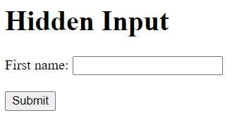
When a form is submitted, a hidden field allows web developers to enter data that users cannot view or change. Although the data in the hidden field is not visible to the user, it is transmitted when the form is submitted. It is frequently used to contain the database record that has to be changed.
<h1>Hidden Input</h1>
<form action="/process.php">
  <label for="fname">First name:</label>
  <input type="text" id="fname" name="fname"><br><br>
  <input type="hidden" id="custId" name="custId" value="348">
  <input type="submit" value="Submit">
</form>
#35. Button
>>Return to Menu
<input type="button">
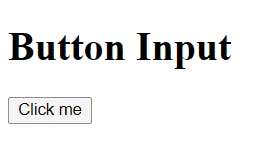
A clickable button is defined by the Button Input which mostly activates a JavaScript or php code when it is clicked.
<h1>Button Input</h1>
<form>
  <input type="button" value="Click me" onclick="msg()">
</form>

<script>
function msg() {
  alert("Hello people!");
}
</script>
#36. Submit
>>Return to Menu
<input type="submit">
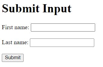
The submit Input specifies a button that sends all form data to a form handler. In most cases, the form-handler is a server page containing a script for processing the submitted data. The form's action attribute specifies the form's handler.
In the example, the form data will be transferred to a page called process.php if you click the Submit button.
<h1>Submit Input</h1>
<form action="/process.php">
  <label for="fname">First name: </label>
  <input type="text" id="fname" name="fname"><br><br>
  <label for="lname">Last name: </label>
  <input type="text" id="lname" name="lname"><br><br>
  <input type="submit" value="Submit">
</form>
#37. Reset
>>Return to Menu
<input type="reset">
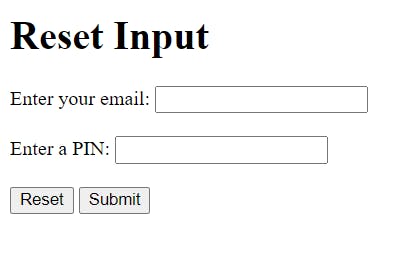
The reset button is defined by the reset input, which resets all form values to their default values.
<h1>Reset Input</h1>
<form action="/action_page.php">
  <label for="email">Enter your email:</label>
  <input type="email" id="email" name="email"><br><br>
  <label for="pin">Enter a PIN:</label>
  <input type="text" id="pin" name="pin" maxlength="4"><br><br>
  <input type="reset" value="Reset">
  <input type="submit" value="Submit">
</form>
#38. Search
>>Return to Menu
<input type="search">
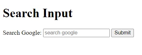
A text box for inputting a search string is defined by the search input. If you don't give the search field a name, nothing will be sent. The parameter "q" is the most often used name for search inputs.
<h1>Search Input</h1>
<form action="/process.php">
  <label for="q">Search Google:</label>
  <input type="search" id="q" name="q" placeholder="search google">
  <input type="submit">
</form>
#39. Number
>>Return to Menu
<input type="number">
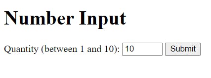
A field for entering a number is defined by the number input.
To specify constraints, use the following attributes:
max - defines the maximum value that can be entered.
min - defines the smallest value that can be used.
step - specifies the legal number intervals.
value - Specifies the default value.
<h1>Number Input</h1>
<form action="/process.php">
  <label for="quantity">Quantity (between 1 and 10):</label>
  <input type="number" id="quantity" name="quantity" min="1" max="10">
  <input type="submit">
</form>
#40. Range
>>Return to Menu
<input type="range">
Range Input is a control that allows you to enter a number whose exact value isn't necessary, just like a slider control. The default range is 0 to 100 as seen in the example, though you can use the properties to determine the integers that are permitted.
max - specifies the maximum value allowed
min - specifies the minimum value allowed
step - specifies the legal number intervals
value - Specifies the default value
<h1>Range Input</h1>
<form action="/action_page.php">
  <label for="vol">Volume (between 0 and 100):</label>
  <input type="range" id="vol" name="vol" min="0" max="100">
  <input type="submit">
</form>

#41. Url
>>Return to Menu
<input type="url">
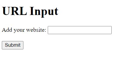
The url input specifies a field where a URL can be entered. Before the form can be submitted, the input value is automatically verified.
<h1>URL Input</h1>
<form action="/process.php">
  <label for="homepage">Add your website:</label>
  <input type="url" id="homepage" name="homepage"><br><br>
  <input type="submit">
</form>
#42. Color
>>Return to Menu
<input type="color">
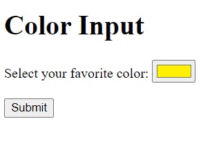
A color picker is defined by the color input. #000000 is the default value (black). The value must be written in hexadecimal format with seven characters.
<h1>Color Input</h1>
<form action="/process.php">
  <label for="favcolor">Select your favorite color:</label>
  <input type="color" id="favcolor" name="favcolor" value="#fff000"><br><br>
  <input type="submit">
</form>
#43. Image
>>Return to Menu
<input type="image">
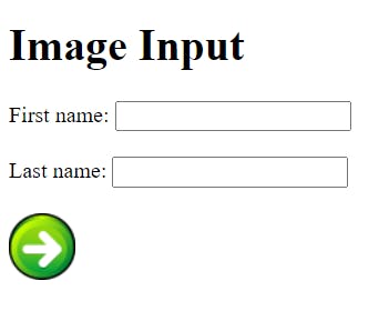
An image is defined as a submit button by the image input. The src property specifies the image's location. The X and Y coordinates of the click that activated the image button are sent via the image input.
<h1>Image Input</h1>
<form action="/process.php">
  <label for="fname">First name: </label>
  <input type="text" id="fname" name="fname"><br><br>
  <label for="lname">Last name: </label>
  <input type="text" id="lname" name="lname"><br><br>
  <input type="image" src="img_submit.gif" alt="Submit" width="48" height="48">
</form>
#44. Date
>>Return to Menu
<input type="date">
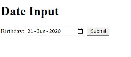
The date input defines a date picker. The resulting value includes the year, month, and day (no Time is included).
<h1>Date Input</h1>
<form action="/process.php">
  <label for="birthday">Birthday:</label>
  <input type="date" id="birthday" name="birthday">
  <input type="submit">
</form>
#45. Datetime-local
>>Return to Menu
<input type="datetime-local">
The datetime-local input defines a date picker. The resulting value includes the year, month, day, and time.
<h1>Datetime-local Input</h1>
<form action="/process.php">
  <label for="birthdaytime">Birthday (date and time):</label>
  <input type="datetime-local" id="birthdaytime" name="birthdaytime">
  <input type="submit">
</form>

#46. Time
>>Return to Menu
<input type="time">
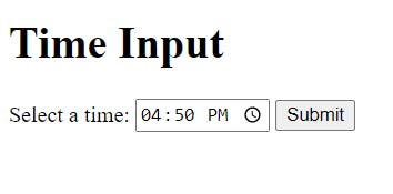
The Time input defines a control for entering a time (no time zone).
<h1>Time Input</h1>
<form action="/process.php">
  <label for="appt">Select a time:</label>
  <input type="time" id="appt" name="appt">
  <input type="submit">
</form>
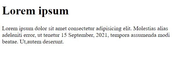
Time can also be used as a tag to format a date string:
<div>
    <h1>Lorem ipsum</h1>
    <p>Lorem ipsum dolor sit amet consectetur adipisicing elit. Molestias alias adeleniti error, ut tenetur <time datetime="2021-09-15">15 September, 2021</time>, tempora assumenda modi beatae. Ut,autem deserunt.</p>
</div>
#47. Week
>>Return to Menu
<input type="week">
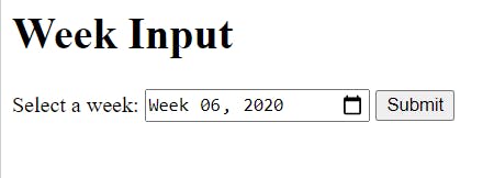
The week input defines a week and year control (no time zone).
<h1>Week Input</h1>
<form action="/process.php">
  <label for="week">Select a week:</label>
  <input type="week" id="week" name="week">
  <input type="submit">
</form>
#48. Month
>>Return to Menu
<input type="month">
The month input defines a month and year control. The format is "YYYY-MM".
<h1>Month Input</h1>
<form action="/process.php">
  <label for="bdaymonth">Birthday (month and year):</label>
  <input type="month" id="bdaymonth" name="bdaymonth">
  <input type="submit">
</form>

#49. Fieldset and Legend
>>Return to Menu
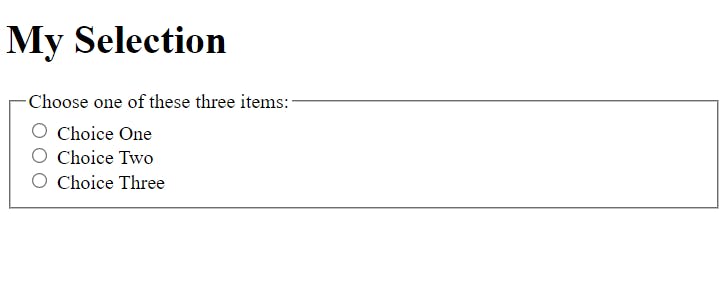
<div>
    <h1>My Selection</h1>
    <form>
        <fieldset>
            <legend>Choose one of these three items:</legend>
            <input id="one" type="radio" name="items" value="one" />
            <label for="one">Choice One</label><br />
            <input id="two" type="radio" name="items" value="two" />
            <label for="two">Choice Two</label><br />
            <input id="three" type="radio" name="items" value="three" />
            <label for="three">Choice Three</label>
        </fieldset>
    </form>
</div>
#50. Table
>>Return to Menu
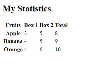
<section>
<h1>My Statistics</h1>
<table id="myTable">
    <thead>
        <tr>
            <th>Fruits</th>
            <th scope="col">Box 1</th>
            <th scope="col">Box 2</th>
            <th scope="col">Total</th>
        </tr>
    </thead>
    <tbody>
        <tr>
            <th scope="row">Apple</th>
                <td>3</td>
                <td>5</td>
                <td>8</td>
        </tr>
        <tr>
            <th scope="row">Banana</th>
                <td>4</td>
                <td>5</td>
                <td>9</td>
        </tr>
        <tr>
            <th scope="row">Orange</th>
                <td>4</td>
                <td>6</td>
                <td>10</td>
        </tr>
    </tbody>
</table>
</section>
#51. Accesskey
>>Return to Menu
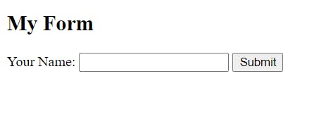
The accesskey attribute in HTML5 allows you to provide a shortcut key to focus on an element. For keyboard-only users, adding an accesskey attribute can make navigation more efficient.
<section>
    <h1>My Form</h1>
    <form action="">
        <label for="firstname">
                Your Name:
                <input type="text" id="firstname" />
                <button type="submit" accesskey="b">Submit</button>
        </label>
    </form>
</section>
#52. Tabindex
>>Return to Menu
When a user tabs through a website, certain components like links and form controls gain keyboard selection by default. In the same way, elements such as div, span, and p tags can be given the same functionality by using the tabindex="0" attribute. When you use a tabindex="1," the keyboard focus will be drawn to that element first. Then it cycles through the series of provided tabindex values (2, 3, etc.), and afterwards it moves on to the default and tabindex="0" items.
<section>
    <h1>My Form</h1>
    <p tabindex="0">
        Instructions: Please fill in your information below then click <b>Submit</b>
    </p>
    <form action="">
        <label for="firstname">
            Your Name:
            <input type="text" id="firstname" />
            <button type="submit" accesskey="b">Submit</button>
        </label>
    </form>
</section>

Conclusion
Hope I was able to sufficiently cover the basic HTML tags and features. If I left anyone out, please do let me know. Thanks!
#End
Hope you enjoyed this! :) Follow me for more contents...
Get in Touch:
ifeanyiomeata.com
contact@ifeanyiomeata.com
Youtube: youtube.com/c/IfeanyiOmeata
Linkedin: linkedin.com/in/omeatai
Twitter: twitter.com/iomeata
Github: github.com/omeatai
Stackoverflow: stackoverflow.com/users/2689166/omeatai
Hashnode: hashnode.com/@omeatai
Medium: medium.com/@omeatai
© 2021

