Hi, we are going to talk about the Grid columns and row lines. To understand this, I have changed our code from the previous post to create a row of 12 div blocks or cells. We will need this setup to understand how CSS Grids work.
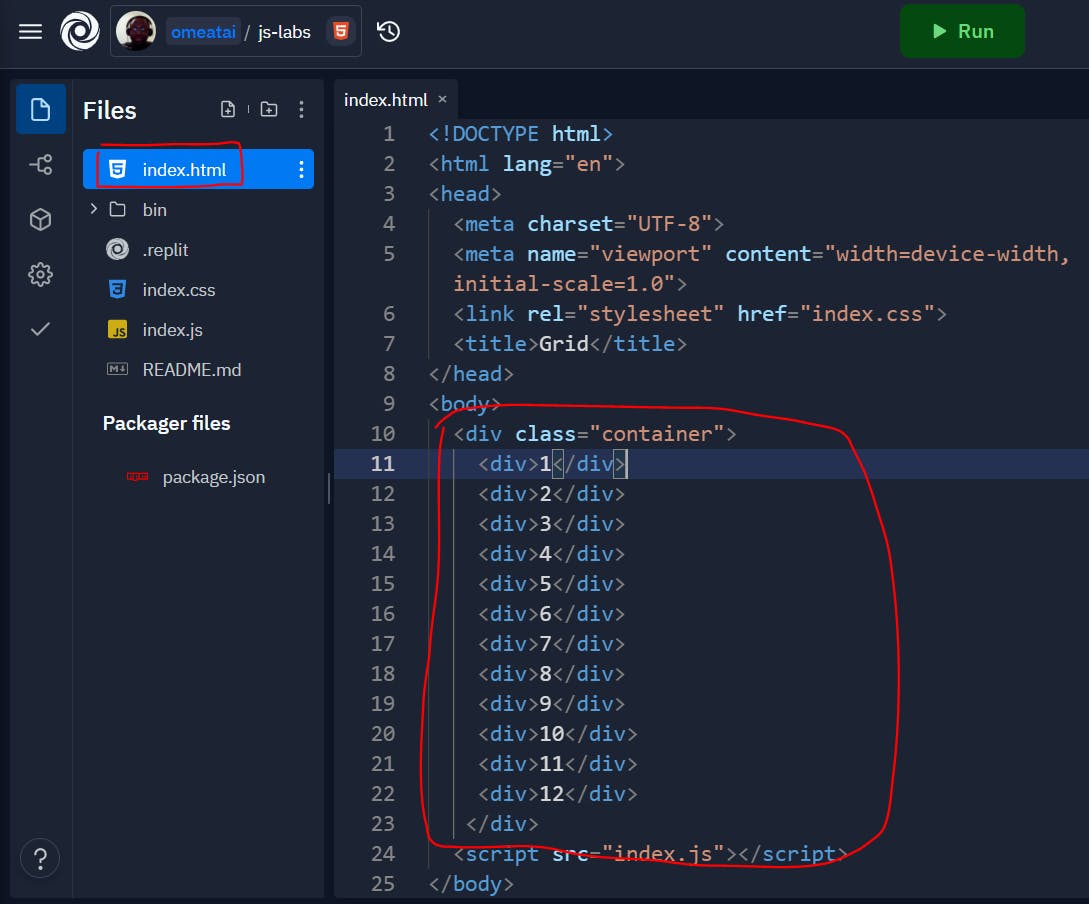
#1. This is our index.html file.
<!DOCTYPE html>
<html lang="en">
<head>
  <meta charset="UTF-8">
  <meta name="viewport" content="width=device-width, initial-scale=1.0">
  <link rel="stylesheet" href="index.css">
  <title>Grid</title>
</head>
<body>
  <div class="container">
    <div>1</div>
    <div>2</div>
    <div>3</div>
    <div>4</div>
    <div>5</div>
    <div>6</div>
    <div>7</div>
    <div>8</div>
    <div>9</div>
    <div>10</div>
    <div>11</div>
    <div>12</div>
   </div>
  <script src="index.js"></script>
</body>
</html>
#2. This is our index.css file.
body {
  box-sizing: border-box;
}

.container {
  display: grid;
  grid-template: repeat(6, 1fr)/repeat(12, 1fr);
  /* grid-gap: 3px; */
}

.container > div {
  padding: 10px;
  background: #e76f51;
  font-size: 2rem;
  display: flex;
  justify-content: center;
  align-items: center;
  border-left: 5px solid #000;
}

.container > div:nth-child(12){
  border-right: 5px solid #000;
}

.container > div:nth-of-type(2n){
  background: #2a9d8f;
}

.container > div:nth-child(3n){
  background: #e9c46a;
}
#3. So, our output will look like this.
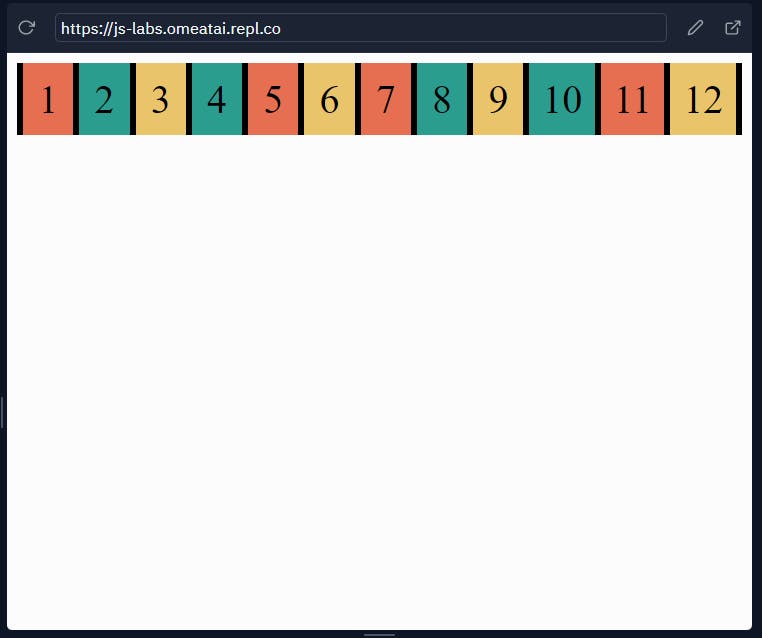
#4. Let us now focus on the column lines. We can see that there are 13 column lines in the 12 blocks. So it means we can make reference to each line based on their position in the Grid. The first line (left of block 1) is column position 1, the next line (between block 1 and block 2) is position 2, and so on...
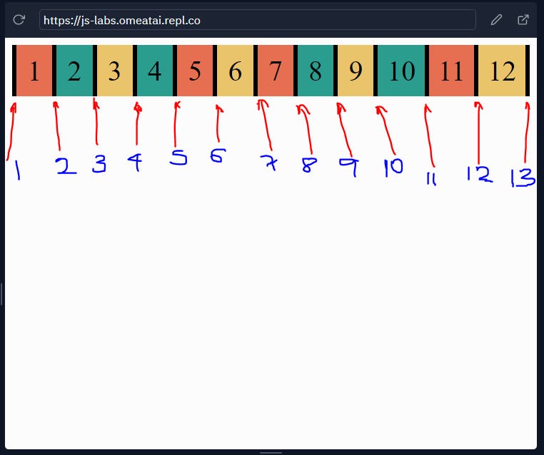
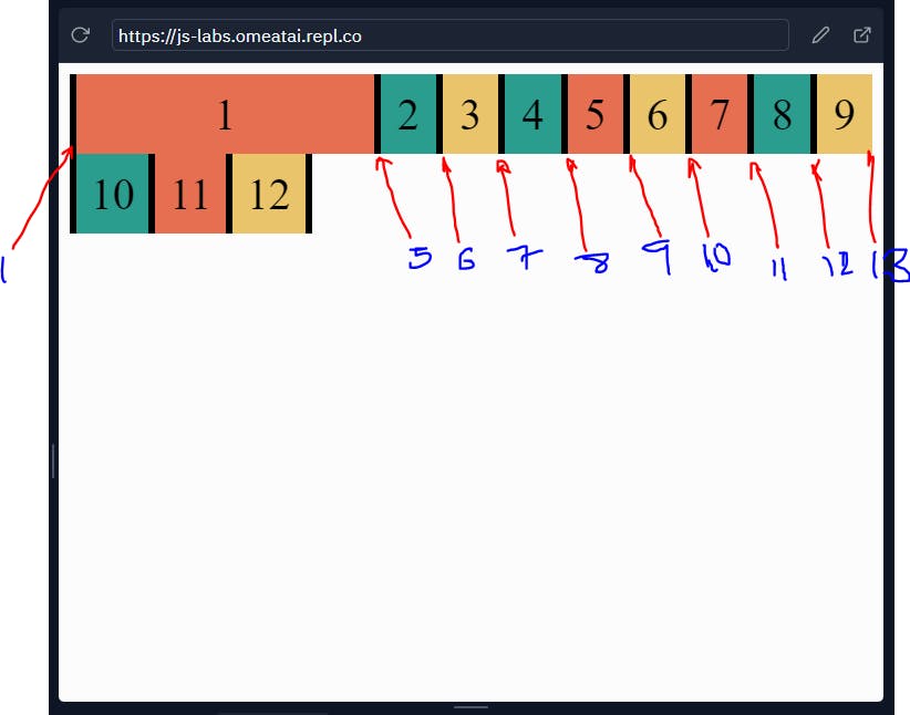
#5. So, the CSS Grid system gives us the opportunity to style the blocks based on their column lines. For example, let's extend block 1 to span between column line 1 (left of block 1) and column line 5 (right of block 4). We would see that the Grid position is still maintained even though the blocks have moved. Also note that we have 13 column grid lines per row because we set the Grid-template-column to 12 multiples of 1 fraction.

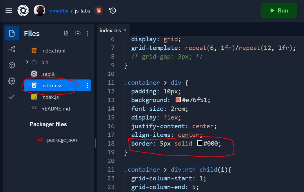
#6. Next, I have adjusted the code a bit so that all the blocks are bordered all round. We will use this to explain how Grid-row lines also work.
.container > div {
  padding: 10px;
  background: #e76f51;
  font-size: 2rem;
  display: flex;
  justify-content: center;
  align-items: center;
  border: 5px solid #000;
}
#7. We can also see that we have Grid-row lines that we can make reference to. Take note that our grid-template-row specifies 6 multiples of 1 fraction (which means 6 available rows), so even if the extra rows have not been filled by the blocks, they still exists virtually and as you will see we will make reference to it.

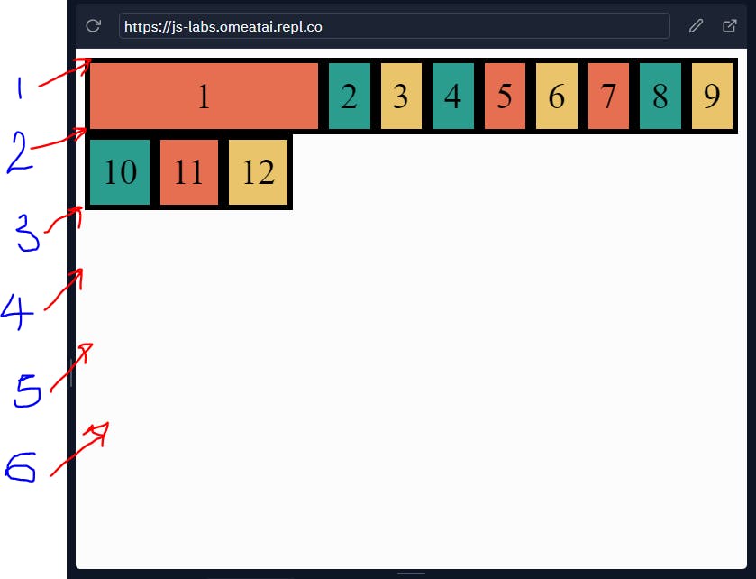
#8. So, let's extend Block 1 from row line 1 (line above block 1) to row line 4(In the imaginary blocks).
.container > div:nth-child(1){
  grid-column-start: 1;
  grid-column-end: 5;
  grid-row-start: 1;
  grid-row-end: 4;
}
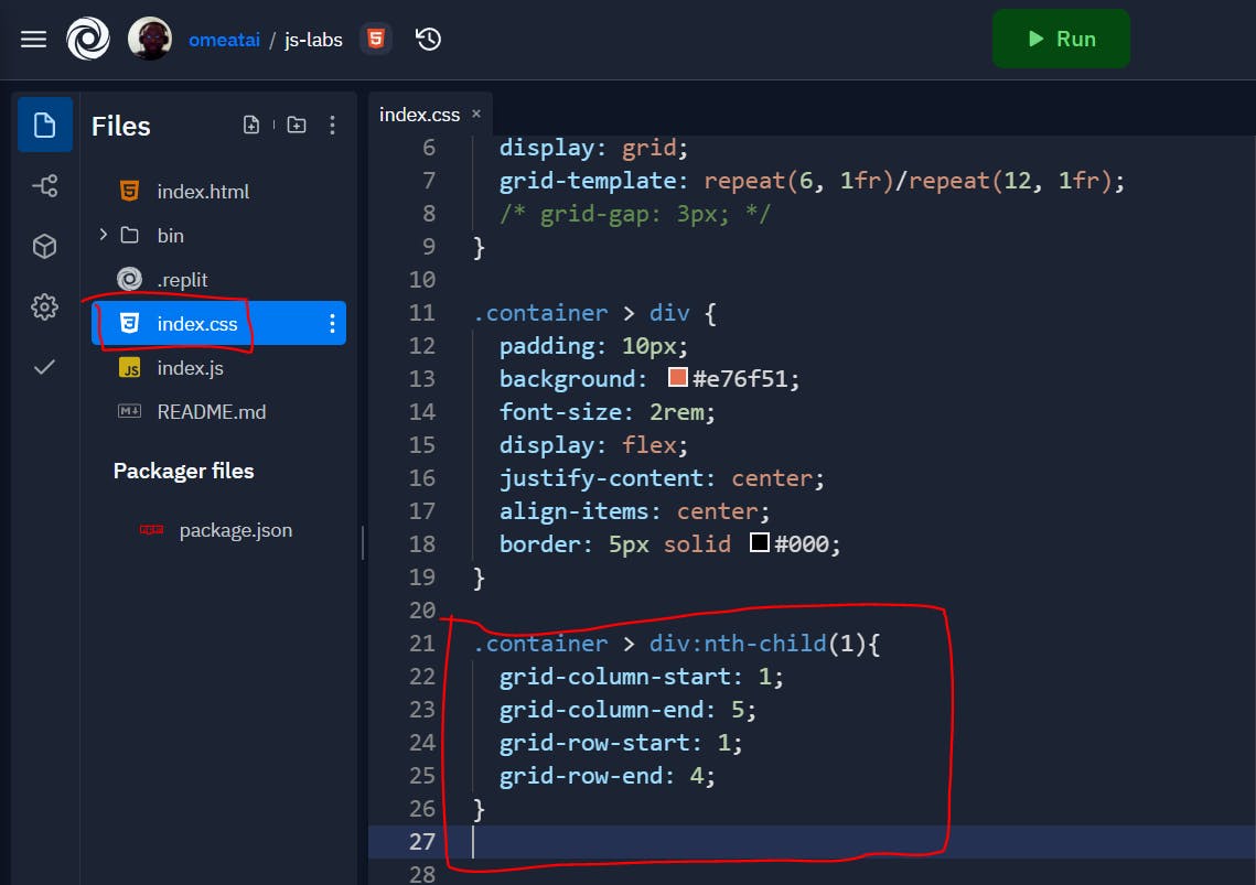 Our output will now look like this:
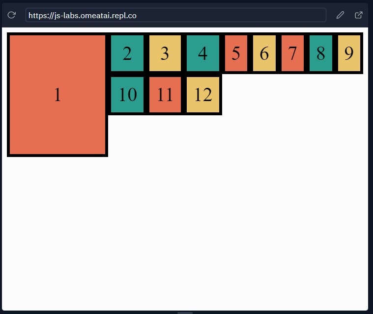 To show the Grid-row lines:
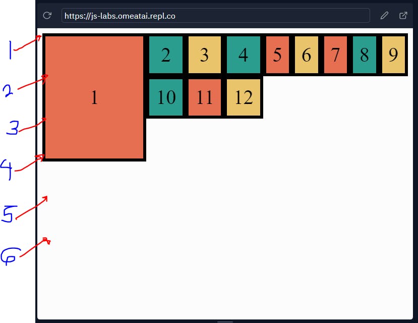
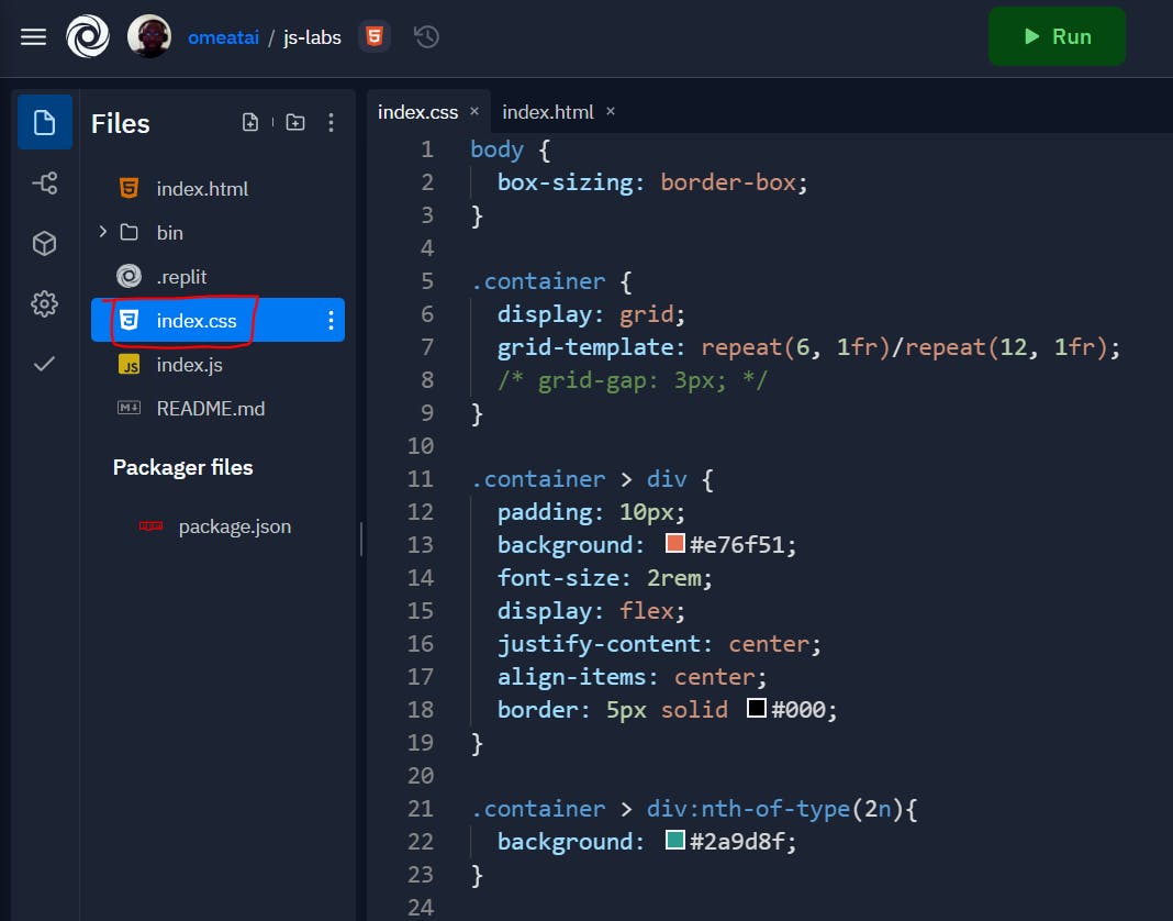
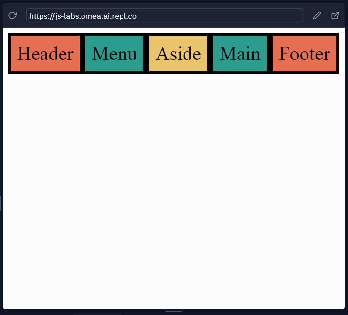
#9. Now that we have understood how Grid lines work, let's try and create a layout for a website. I have modified the code a bit so that we can accomodate the parts of the website layout.
The Index.html file:
<!DOCTYPE html>
<html lang="en">
<head>
  <meta charset="UTF-8">
  <meta name="viewport" content="width=device-width, initial-scale=1.0">
  <link rel="stylesheet" href="index.css">
  <title>Grid</title>
</head>
<body>
  <div class="container">
      <div class="header">Header</div>
      <div class="menu">Menu</div>
      <div class="aside">Aside</div>
      <div class="main">Main</div>
      <div class="footer">Footer</div>
  </div>
  <script src="index.js"></script>
</body>
</html>
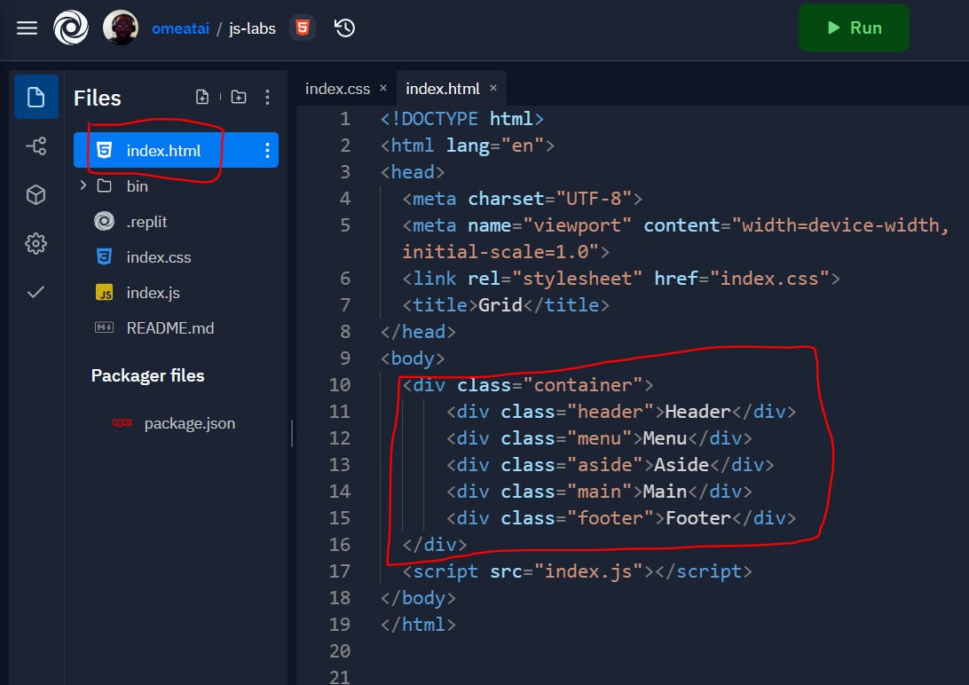
The Index.css file:
body {
  box-sizing: border-box;
}

.container {
  display: grid;
  grid-template: repeat(6, 1fr)/repeat(12, 1fr);
  /* grid-gap: 3px; */
}

.container > div {
  padding: 10px;
  background: #e76f51;
  font-size: 2rem;
  display: flex;
  justify-content: center;
  align-items: center;
  border: 5px solid #000;
}

.container > div:nth-of-type(2n){
  background: #2a9d8f;
}

.container > div:nth-child(3n){
  background: #e9c46a;
}
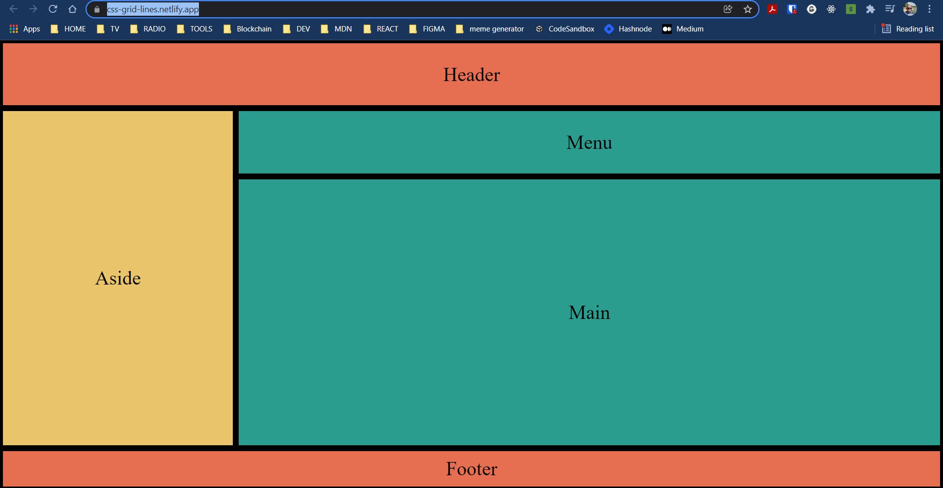
The output should look like this:
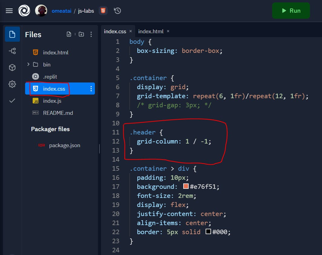
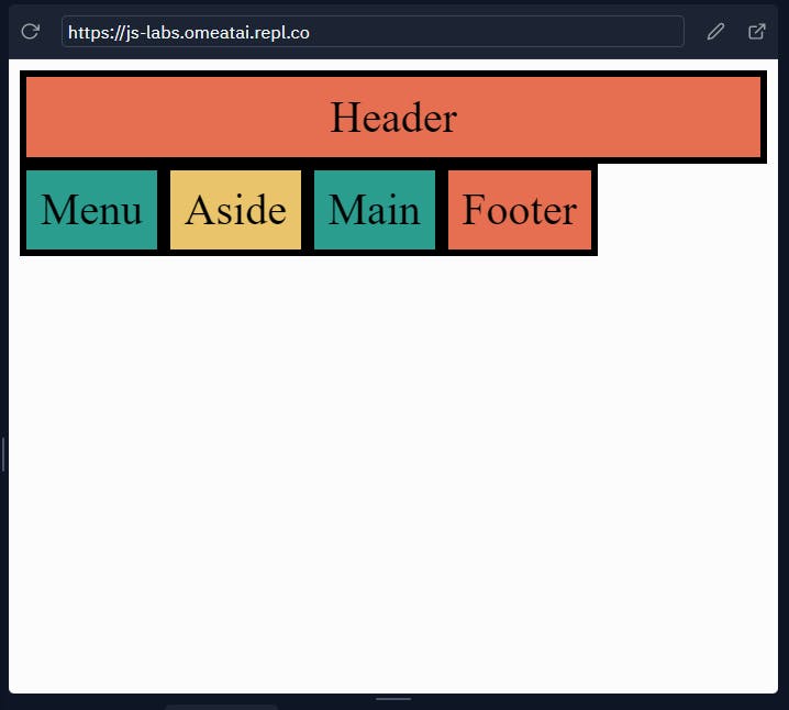
#10. Let's start by styling the header to span the whole length from the column-line 1 to column-line 13.
.header {
  grid-column-start: 1;
  grid-column-end: 13;
}
Another way of expressing the Grid statement:
.header {
  grid-column-start: 1;
  grid-column-end: -1;
}
The (-1) means to look for the last column-line in the row. Yet, another way of writing the statement:
.header {
  grid-column: 1 / -1;
}
Our output should now look like this:
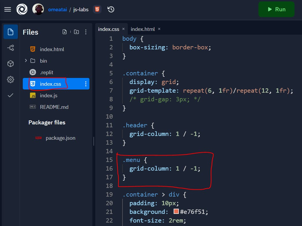
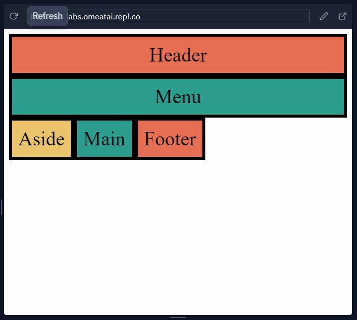
#11. Let's style the menu the same way to span the whole length from the column-line 1 to column-line 13.
.menu {
  grid-column: 1 / -1;
}
The output:
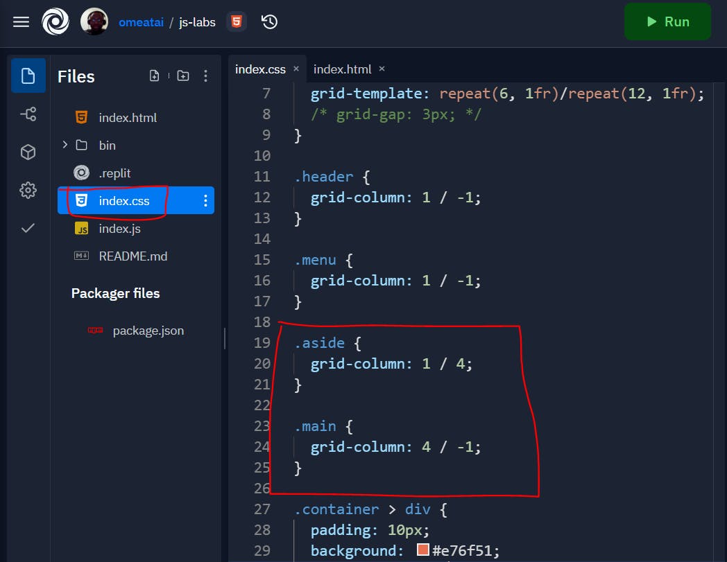
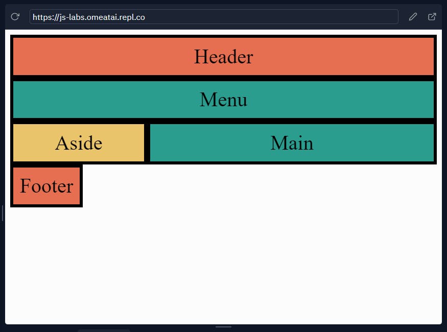
#12. Next, let's style the aside and main contents. This time we will extend the aside block to span the length from the column-line 1 to column-line 4 since we would like to use only 3 column blocks for the span column size. Also, we would extend the main block to start from column-line 4 to the end of the row.
.aside {
  grid-column: 1 / 4;
}

.main {
  grid-column: 4 / -1;
}
So, our output will be:
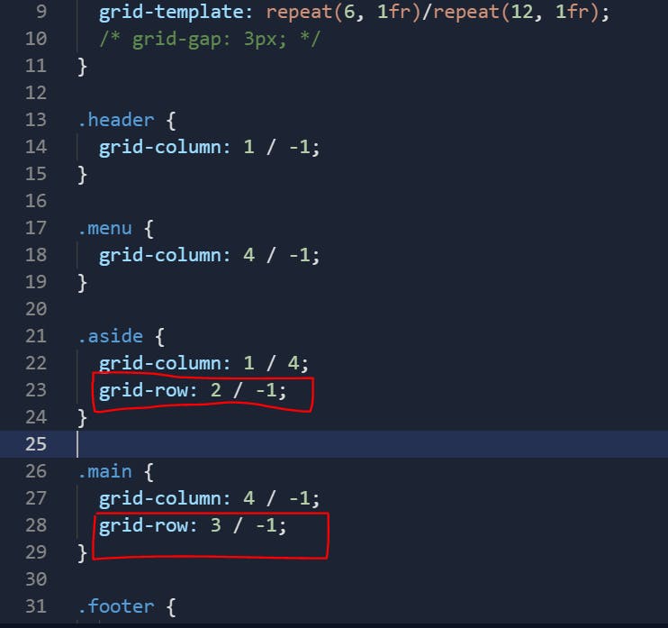
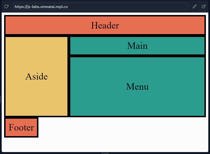
#13. Let's also stretch the aside block to span from the grid-row line 2 (line above the main block) to the end of the row, which means we also need to adjust the grid-column for the menu block to accomodate the extension of the aside row. We would also extend the grid-row of the main block to end at the grid-row line 6.
.menu {
  grid-column: 4 / -1;
}

.aside {
  grid-column: 1 / 4;
  grid-row: 2 / -1;
}

.main {
  grid-column: 4 / -1;
  grid-row: 3 / -1;
}
So, our output will look like this:
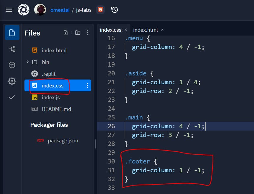
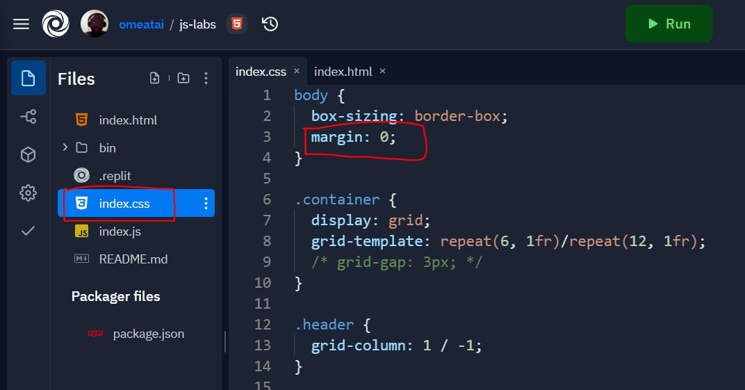
#14. Let's also extend our footer to stretch to the end of the row. Let's also remove the margins from the body.
.footer {
  grid-column: 1 / -1;
}
The output:
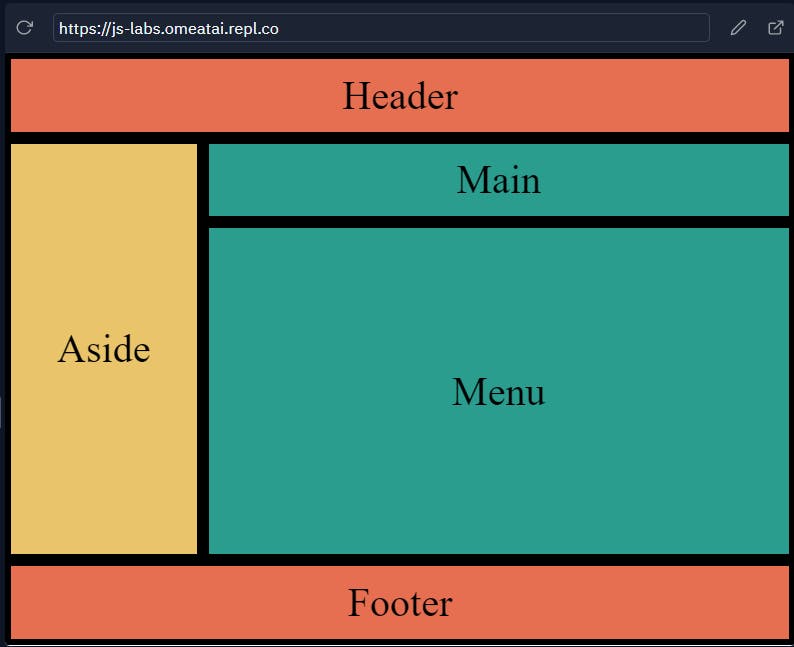
#15. We are done, however I noticed that our height is not responsive when seen in desktop view:
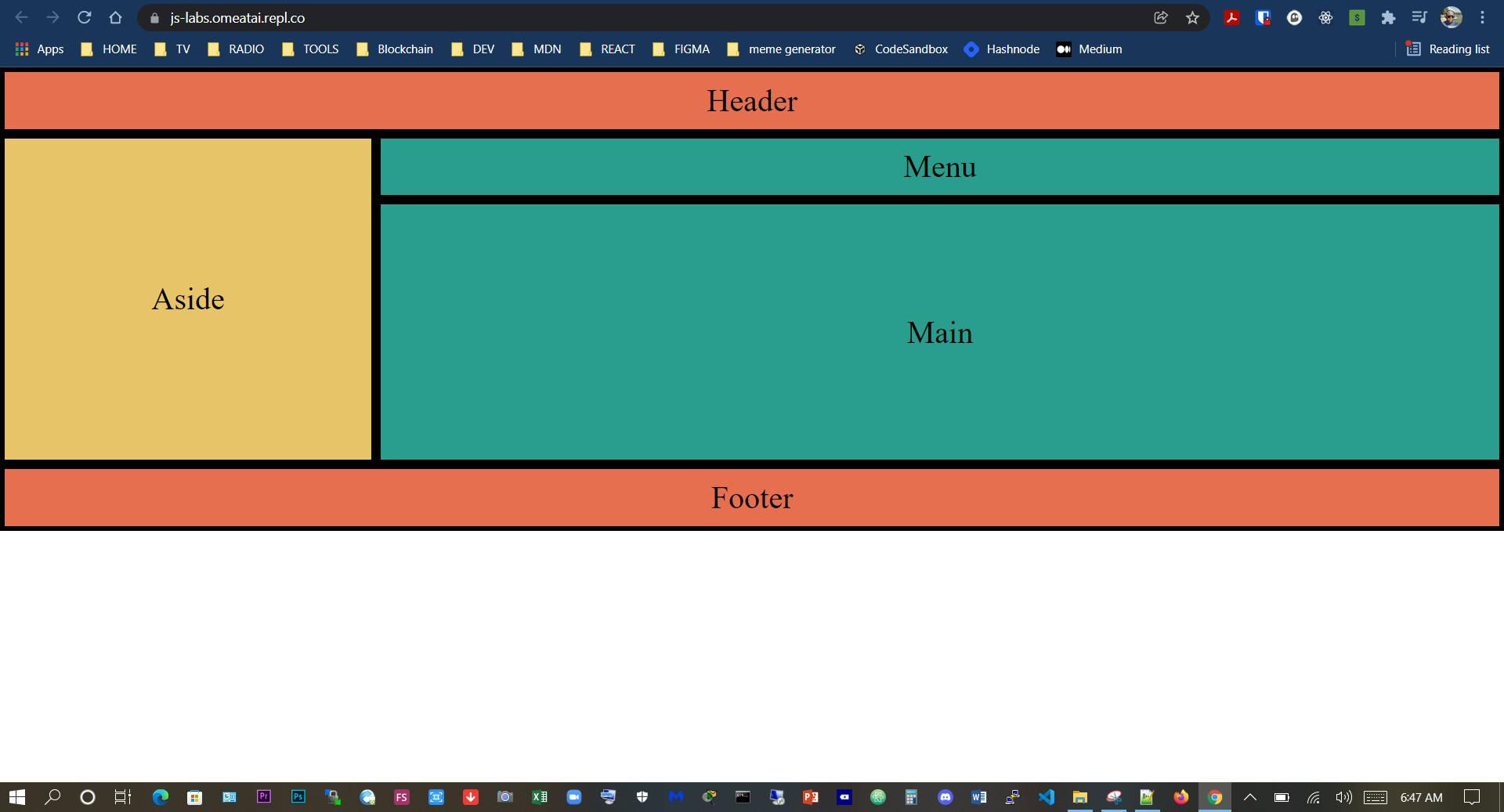
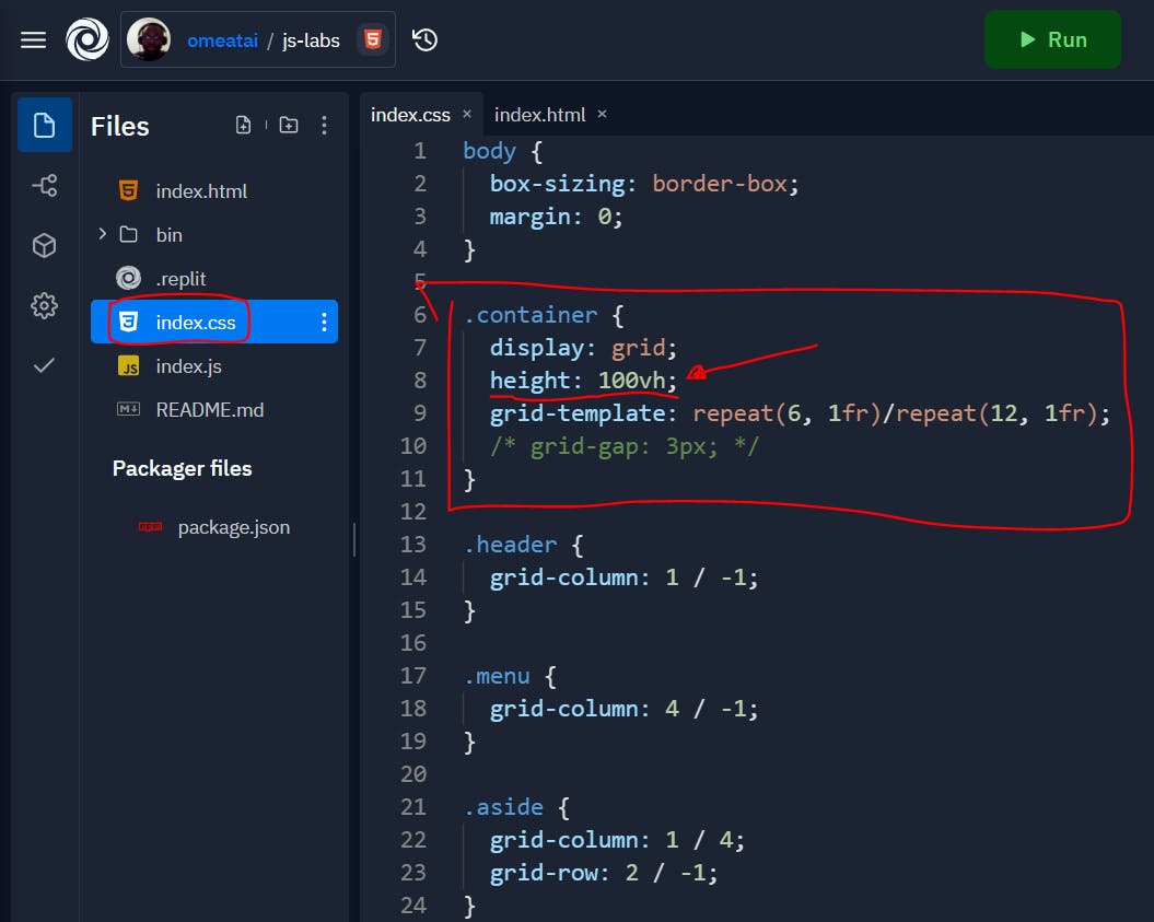
#16. So, we will just include a height of 100vH (viewport Height) styling to make it vertically responsive too for mobile, tablet and desktop view.
body {
  box-sizing: border-box;
  margin: 0;
}

.container {
  display: grid;
  height: 100vh;
  grid-template: repeat(6, 1fr)/repeat(12, 1fr);
  /* grid-gap: 3px; */
}

.header {
  grid-column: 1 / -1;
}

.menu {
  grid-column: 4 / -1;
}

.aside {
  grid-column: 1 / 4;
  grid-row: 2 / -1;
}

.main {
  grid-column: 4 / -1;
  grid-row: 3 / -1;
}

.footer {
   grid-column: 1 / -1;
}

.container > div {
  padding: 10px;
  background: #e76f51;
  font-size: 2rem;
  display: flex;
  justify-content: center;
  align-items: center;
  border: 5px solid #000;
}

.container > div:nth-of-type(2n){
  background: #2a9d8f;
}

.container > div:nth-child(3n){
  background: #e9c46a;
}
#17. So, our desktop view:
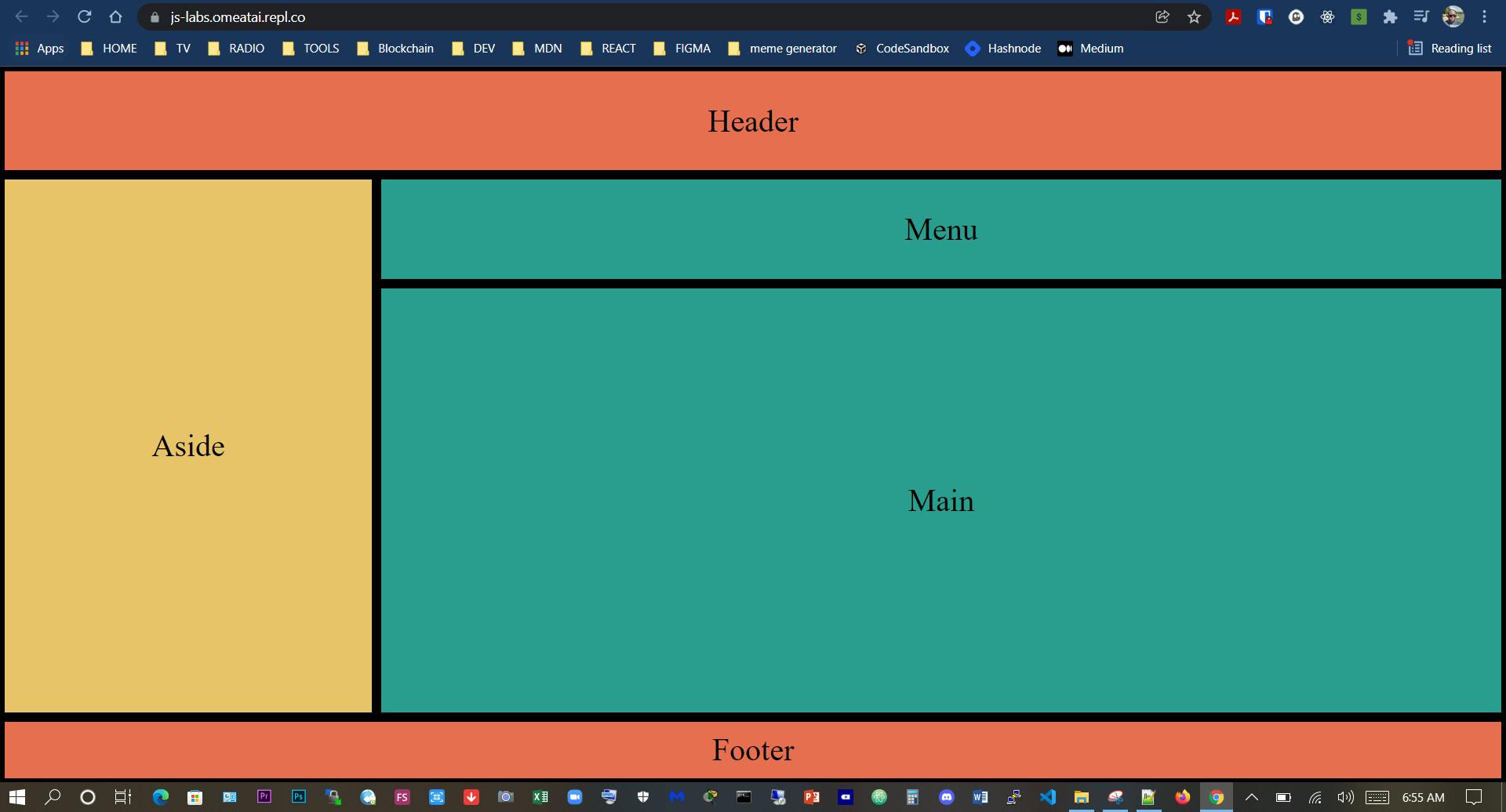
#18. Our mobile view:
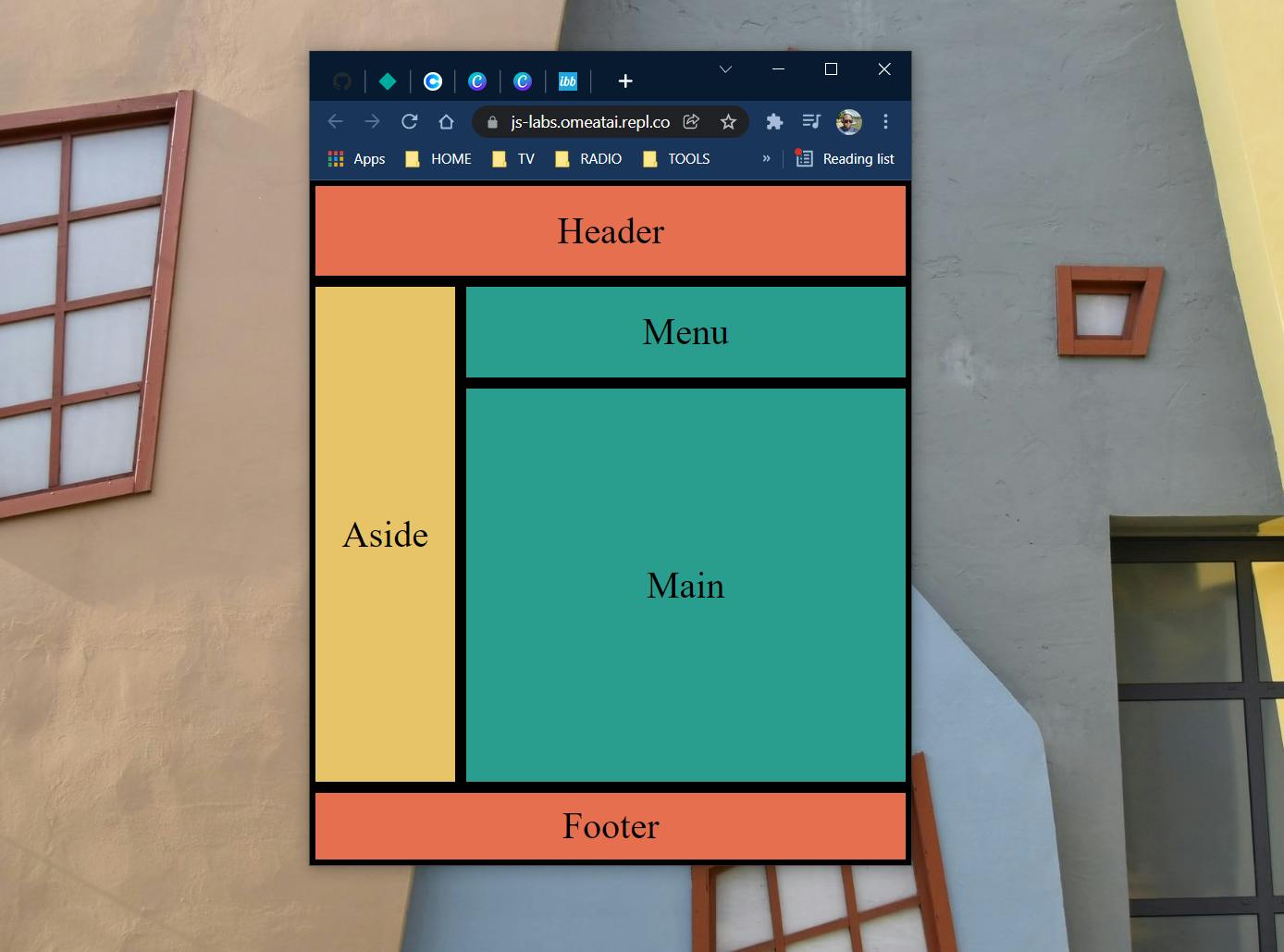
Note: We can still use CSS media queries to further adjust the mobile layout to be more responsive and friendly. However, we decided not to do that because this post is centered on how to use CSS Grid only.
#End
Hope you enjoyed this! :) Follow me for more contents...
Get in Touch:
ifeanyiomeata.com
contact@ifeanyiomeata.com
Youtube: youtube.com/c/IfeanyiOmeata
Linkedin: linkedin.com/in/omeatai
Twitter: twitter.com/iomeata
Github: github.com/omeatai
Stackoverflow: stackoverflow.com/users/2689166/omeatai
Hashnode: hashnode.com/@omeatai
Medium: medium.com/@omeatai
© 2021<br

