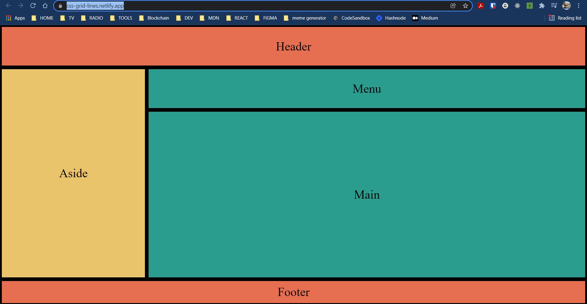
Hi, we are going to talk about Grid Areas and we would continue from our previous post. We will need this setup to understand how CSS Grid Areas work.
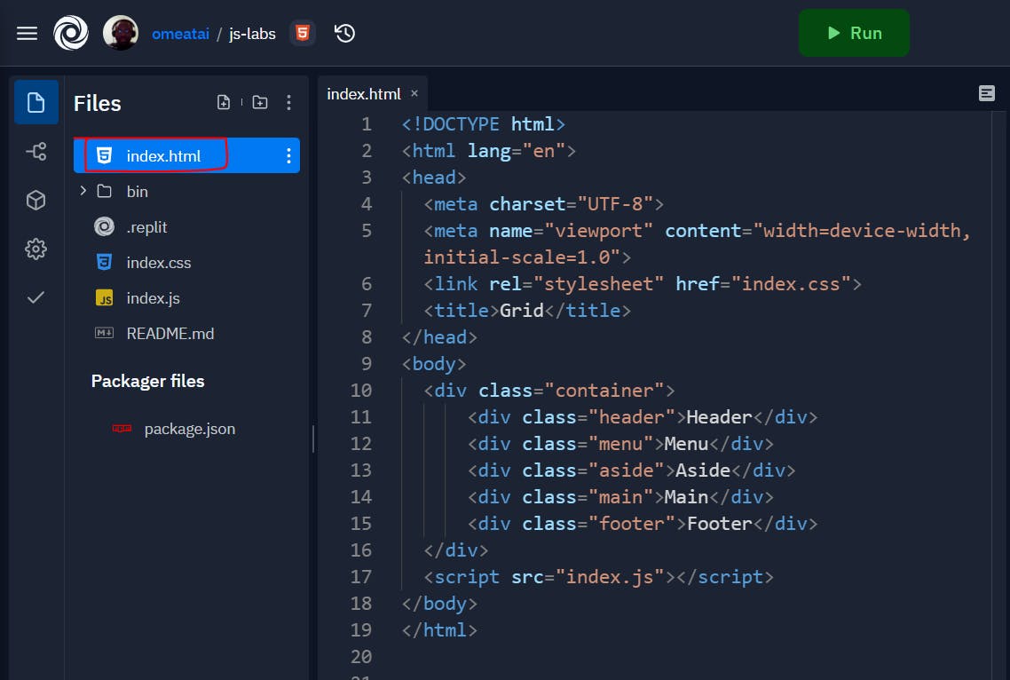
#1. This is still our index.html file.
<!DOCTYPE html>
<html lang="en">
<head>
  <meta charset="UTF-8">
  <meta name="viewport" content="width=device-width, initial-scale=1.0">
  <link rel="stylesheet" href="index.css">
  <title>Grid</title>
</head>
<body>
  <div class="container">
      <div class="header">Header</div>
      <div class="menu">Menu</div>
      <div class="aside">Aside</div>
      <div class="main">Main</div>
      <div class="footer">Footer</div>
  </div>
  <script src="index.js"></script>
</body>
</html>
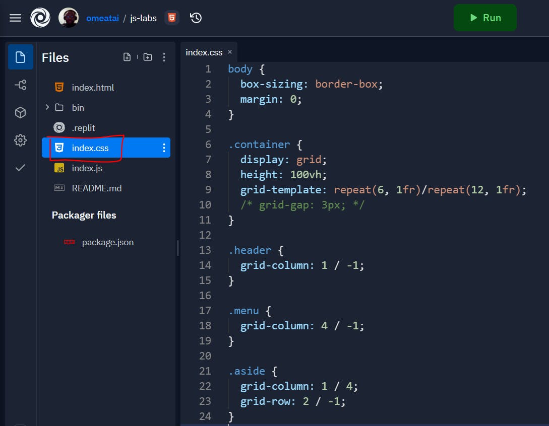
#2. This is our index.css file.
body {
  box-sizing: border-box;
  margin: 0;
}

.container {
  display: grid;
  height: 100vh;
  grid-template: repeat(6, 1fr)/repeat(12, 1fr);
  /* grid-gap: 3px; */
}

.header {
  grid-column: 1 / -1;
}

.menu {
  grid-column: 4 / -1;
}

.aside {
  grid-column: 1 / 4;
  grid-row: 2 / -1;
}

.main {
  grid-column: 4 / -1;
  grid-row: 3 / -1;
}

.footer {
   grid-column: 1 / -1;
}

.container > div {
  padding: 10px;
  background: #e76f51;
  font-size: 2rem;
  display: flex;
  justify-content: center;
  align-items: center;
  border: 5px solid #000;
}

.container > div:nth-of-type(2n){
  background: #2a9d8f;
}

.container > div:nth-child(3n){
  background: #e9c46a;
}
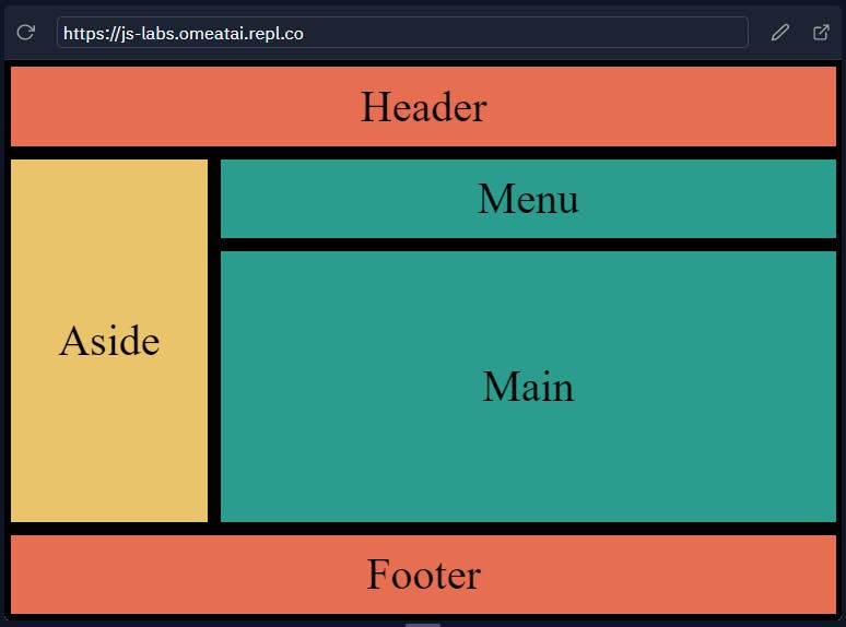
#3. This is our output.
#4. To use Grid areas, we will have to introduce the grid-template-areas. Grid areas are quite similar to using Grid column and row lines, the difference is that the Grid Area considers the entire domain of column and row dimensions and represents graphically how the div blocks will be positioned on the page. Let's create the grid-template-areas to explain this. Remember the Grid-template-areas dimensions should be similar to the dimensions set for the original Grid-template (Grid-template-rows / Grid-template-columns).
.container {
  display: grid;
  height: 100vh;
  grid-template: repeat(6, 1fr)/repeat(12, 1fr);
  grid-template-areas:
          "h h h h  h h h h  h h h h"
          "n n n n  n n n n  n n n n"
          "a a a a  a a a a  a a a a"
          "m m m m  m m m m  m m m m"
          "m m m m  m m m m  m m m m"
          "f f f f  f f f f  f f f f";
  /* grid-gap: 3px; */
}
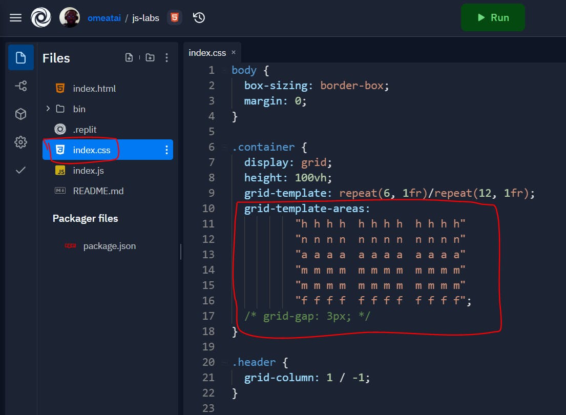
The characters represent the parts of the website. For example:
h = header
n = navbar (menu)
a = aside
m = menu
f = footer
And the repetition of each character determines how much space each block for that part of the website occupies in a rectangular format. To effect the grid-template-areas on the page, we still need to specify what each character represents within the code as the Grid-area:
.header {
  grid-area: h;
}

.menu {
  grid-area: n;
}

.aside {
  grid-area: a;
}

.main {
  grid-area: m;
}

.footer {
   grid-area: f;
}
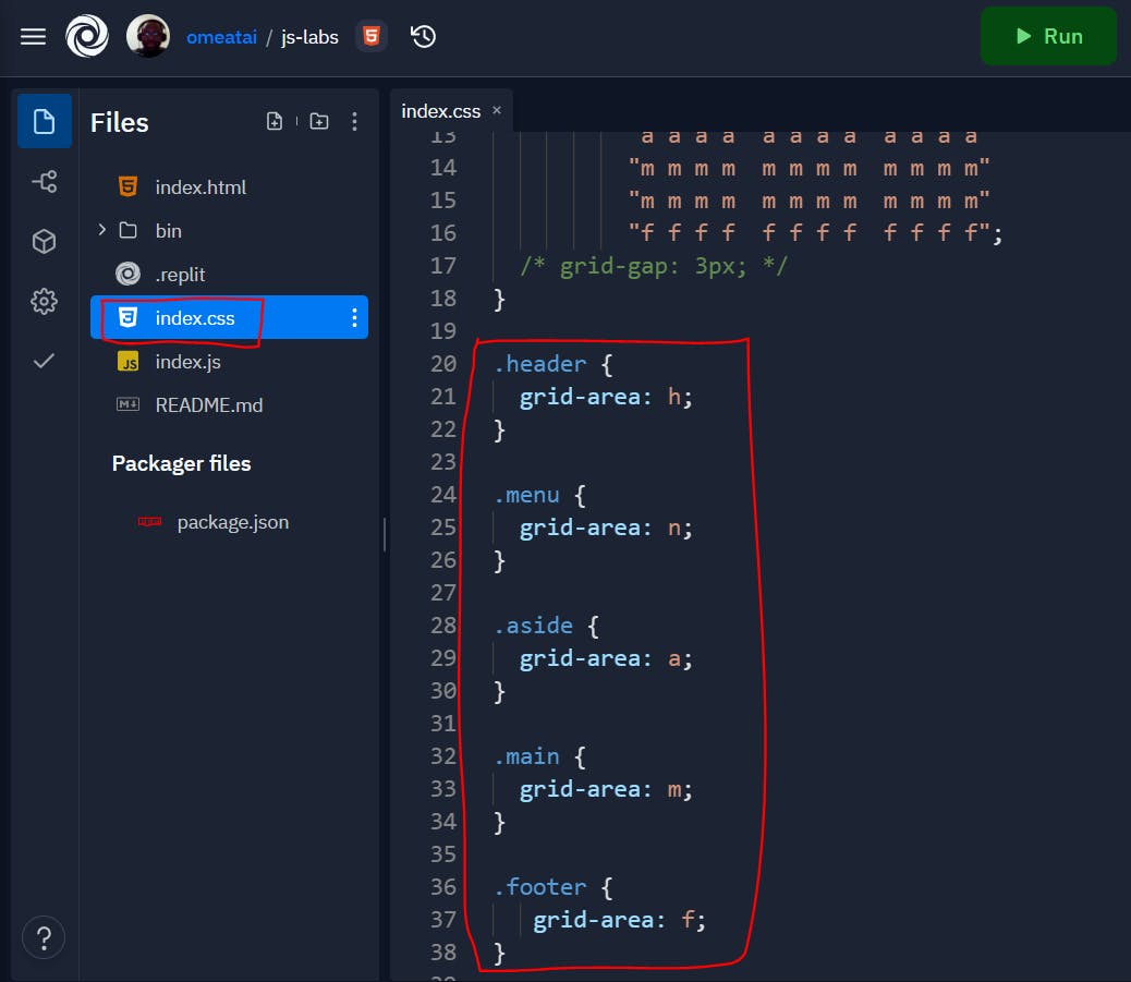
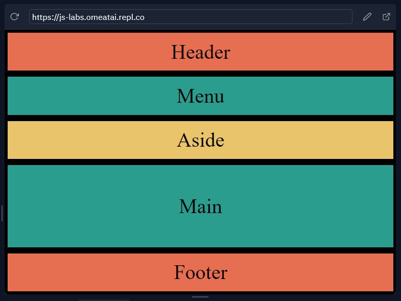
And our output will look like this:
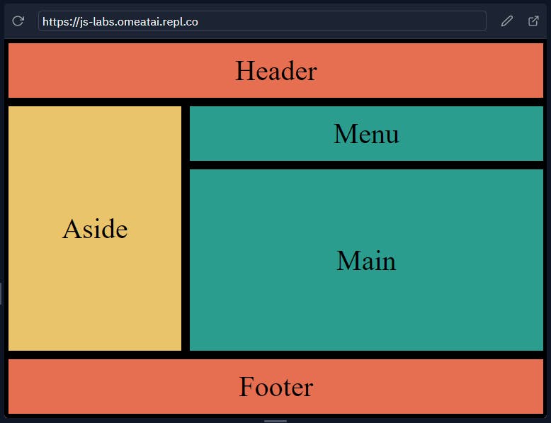
#5. Let's now build the website layout using the Grid-areas. Notice the rearrangement of the Grid-template-areas value and how it affects the layout of the website.
.container {
  display: grid;
  height: 100vh;
  grid-template: repeat(6, 1fr)/repeat(12, 1fr);
  grid-template-areas:
          "h h h h  h h h h  h h h h"
          "a a a a  n n n n  n n n n"
          "a a a a  m m m m  m m m m"
          "a a a a  m m m m  m m m m"
          "a a a a  m m m m  m m m m"
          "f f f f  f f f f  f f f f";
  /* grid-gap: 3px; */
}
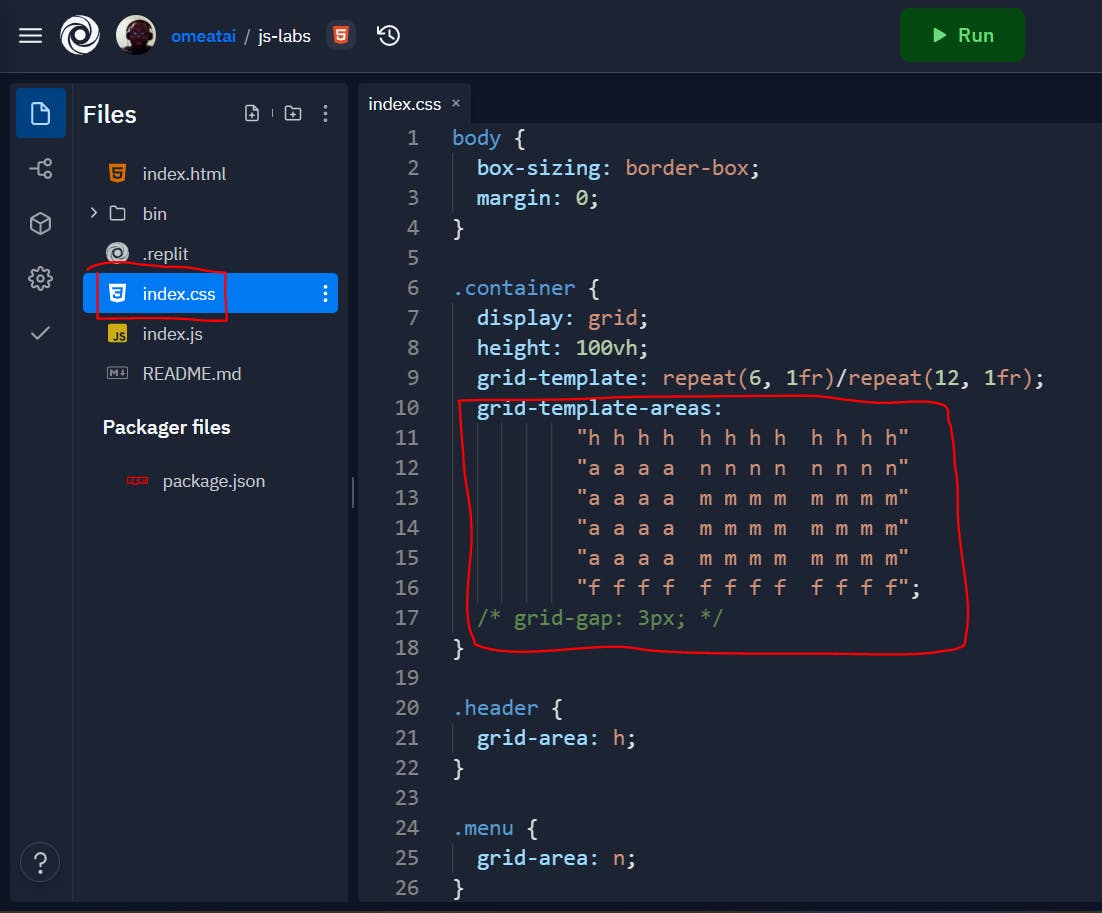
Our Website now looks like this:
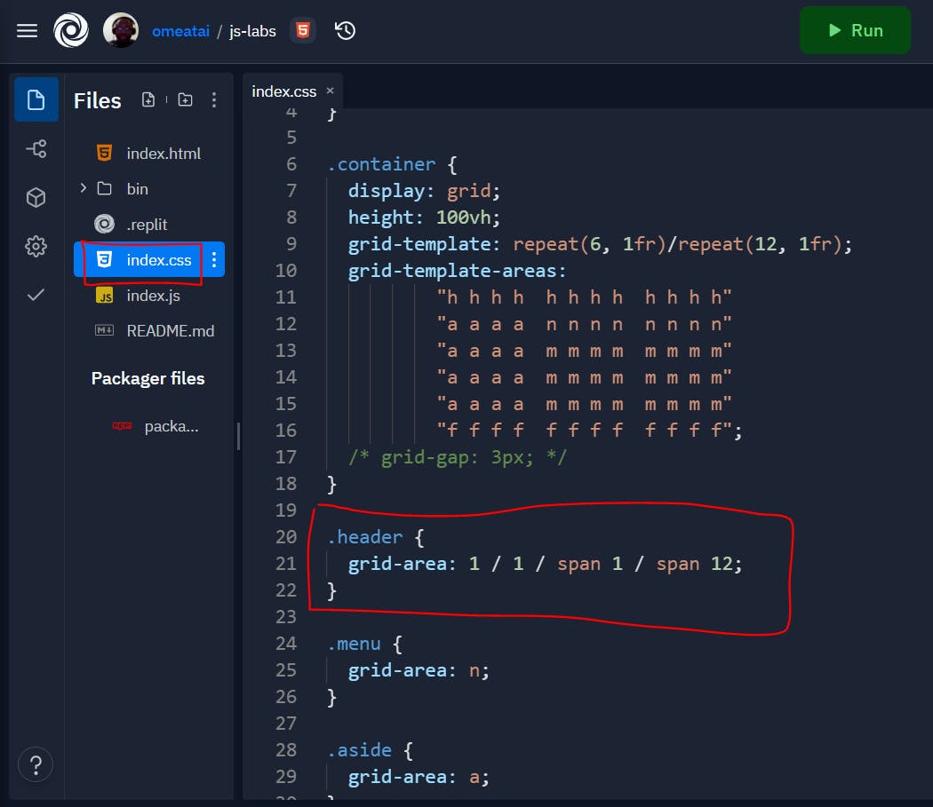
#6. Another way of setting Grid areas is by using the Grid-row-column spatial format:
grid-area: grid-row-line-start (GRLS) / grid-column-line-start (GCLS) / row-span-blocks (RSB) / column-span-blocks (CSB);
So, from our example we can see that for the Header part:
- GRLS = 1 (grid-row-line-start is the first row line above the header)
- GCLS = 1 (grid-column-line-start is the first column line in the header row)
- RSB = span 1 (number of row blocks to occupy)
- CSB = span 12 (number of column blocks to occupy in the row)
So our styling code will look like this:
.header {
  grid-area: 1 / 1 / span 1 / span 12;
}
body {
  box-sizing: border-box;
  margin: 0;
}

.container {
  display: grid;
  height: 100vh;
  grid-template: repeat(6, 1fr)/repeat(12, 1fr);
  grid-template-areas:
          "h h h h  h h h h  h h h h"
          "a a a a  n n n n  n n n n"
          "a a a a  m m m m  m m m m"
          "a a a a  m m m m  m m m m"
          "a a a a  m m m m  m m m m"
          "f f f f  f f f f  f f f f";
  /* grid-gap: 3px; */
}

.header {
  grid-area: 1 / 1 / span 1 / span 12;
}

.menu {
  grid-area: n;
}

.aside {
  grid-area: a;
}

.main {
  grid-area: m;
}

.footer {
   grid-area: f;
}

.container > div {
  padding: 10px;
  background: #e76f51;
  font-size: 2rem;
  display: flex;
  justify-content: center;
  align-items: center;
  border: 5px solid #000;
}

.container > div:nth-of-type(2n){
  background: #2a9d8f;
}

.container > div:nth-child(3n){
  background: #e9c46a;
}
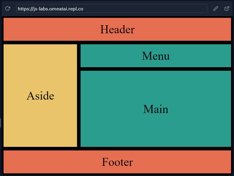
And the output will still remain the same:
#6. Let's now change the rest of the code to use this format:
body {
  box-sizing: border-box;
  margin: 0;
}

.container {
  display: grid;
  height: 100vh;
  grid-template: repeat(6, 1fr)/repeat(12, 1fr);
}

.header {
  grid-area: 1 / 1 / span 1 / span 12;
}

.menu {
  grid-area: 2 / 1 / span 1 / span 12;

}

.aside {
  grid-area: 3 / 1 / span 3 / span 4;

}

.main {
  grid-area: 3 / 5 / span 3 / span 8;

}

.footer {
   grid-area: 6 / 1 / span 1 / span 12;
}

.container > div {
  padding: 10px;
  background: #e76f51;
  font-size: 2rem;
  display: flex;
  justify-content: center;
  align-items: center;
  border: 5px solid #000;
}

.container > div:nth-of-type(2n){
  background: #2a9d8f;
}

.container > div:nth-child(3n){
  background: #e9c46a;
}
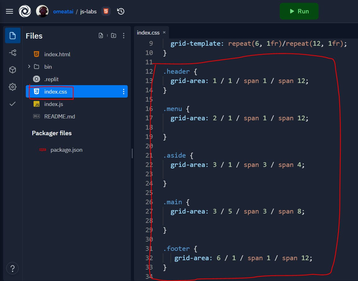
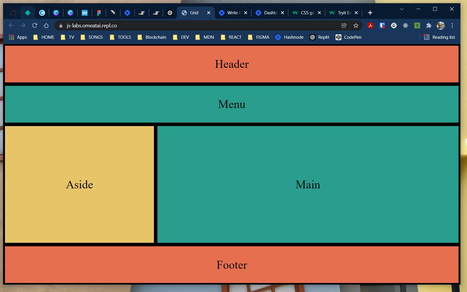
And our output will look the same:
#End
Hope you enjoyed this! :) Follow me for more contents...
Get in Touch:
ifeanyiomeata.com
contact@ifeanyiomeata.com
Youtube: youtube.com/c/IfeanyiOmeata
Linkedin: linkedin.com/in/omeatai
Twitter: twitter.com/iomeata
Github: github.com/omeatai
Stackoverflow: stackoverflow.com/users/2689166/omeatai
Hashnode: hashnode.com/@omeatai
Medium: medium.com/@omeatai
© 2021

