These are some basic Flexbox Topics:
1. Display: flex
>>Return to Menu
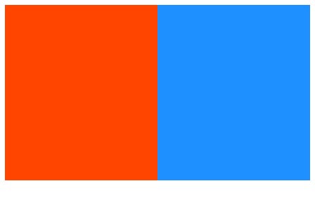
The CSS property display: flex; on an element allows you to use other flex properties to build a responsive page.
2. Flex-direction Property
>>Return to Menu
Adding display: flex to an element turns it into a flex container. This makes it possible to align any children of that element into rows or columns. You do this by adding the flex-direction property to the parent item and setting it to row or column.
3. Justify-content Property
>>Return to Menu
4. Align-items Property
>>Return to Menu
5. Flex-wrap Property
>>Return to Menu
CSS flexbox has a feature to split a flex item into multiple rows (or columns). By default, a flex container will fit all flex items together. For example, a row will all be on one line. However, using the flex-wrap property tells CSS to wrap items. This means extra items move into a new row or column.
6. Flex-shrink Property
>>Return to Menu
The Flex-shrink property allows an item to shrink if the flex container is too small. Items shrink when the width of the parent container is smaller than the combined widths of all the flex items within it. The flex-shrink property takes numbers as values. The higher the number, the more it will shrink compared to the other items in the container.
7. Flex-grow Property
>>Return to Menu
The opposite of flex-shrink is the flex-grow property. Recall that flex-shrink controls the size of the items when the container shrinks. The flex-grow property controls the size of items when the parent container expands.
8. Flex-basis
>>Return to Menu
The flex-basis property specifies the initial size of the item before CSS makes adjustments with flex-shrink or flex-grow. The units used by the flex-basis property are the same as other size properties (px, em, %, etc.). The value auto sizes items based on the content.
9. Flex Shorthand Property
>>Return to Menu
There is a shortcut available to set several flex properties at once. The flex-grow, flex-shrink, and flex-basis properties can all be set together by using the flex property.
10. The order Property
>>Return to Menu
The order property is used to tell CSS the order of how flex items appear in the flex container.
11. Align-self Property
>>Return to Menu
The align-self property allows you to adjust each item's alignment individually, instead of setting them all at once. This is useful since other common adjustment techniques using the CSS properties float, clear, and vertical-align do not work on flex items. Align-self accepts the same values as align-items and will override any value set by the align-items property.
Hope you enjoyed this! :) Follow me for more contents...
Get in Touch:
ifeanyiomeata.com
contact@ifeanyiomeata.com
1. Display: flex
2. Flex-direction Property
3. Justify-content Property
4. Align-items Property
5. Flex-wrap Property
6. Flex-shrink Property
7. Flex-grow Property
8. Flex-basis
9. Flex Shorthand Property
10. The order Property
11. Align-self Property
1. Display: flex
>>Return to Menu
The CSS property display: flex; on an element allows you to use other flex properties to build a responsive page.
<style>
  #box-container {
    height: 500px;
    display: flex;
  }

  #box-1 {
    background-color: dodgerblue;
    width: 50%;
    height: 50%;
  }

  #box-2 {
    background-color: orangered;
    width: 50%;
    height: 50%;
  }
</style>
<div id="box-container">
  <div id="box-1"></div>
  <div id="box-2"></div>
</div>

2. Flex-direction Property
>>Return to Menu
Adding display: flex to an element turns it into a flex container. This makes it possible to align any children of that element into rows or columns. You do this by adding the flex-direction property to the parent item and setting it to row or column.
flex-direction: row;
flex-direction: column;
flex-direction: row-reverse;
flex-direction: column-reverse;
3. Justify-content Property
>>Return to Menu
justify-content: center;
justify-content: flex-start;
justify-content: flex-end;
justify-content: space-between;
justify-content: space-around;
justify-content: space-evenly;
4. Align-items Property
>>Return to Menu
align-items: center;
align-items: flex-start;
align-items: flex-end;
align-items: stretch;
align-items: baseline;
5. Flex-wrap Property
>>Return to Menu
CSS flexbox has a feature to split a flex item into multiple rows (or columns). By default, a flex container will fit all flex items together. For example, a row will all be on one line. However, using the flex-wrap property tells CSS to wrap items. This means extra items move into a new row or column.
flex-wrap: nowrap;
flex-wrap: wrap;
flex-wrap: wrap-reverse;

#box {
    width: 25%;
    height: 50%;
  }
6. Flex-shrink Property
>>Return to Menu
The Flex-shrink property allows an item to shrink if the flex container is too small. Items shrink when the width of the parent container is smaller than the combined widths of all the flex items within it. The flex-shrink property takes numbers as values. The higher the number, the more it will shrink compared to the other items in the container.
#box-1 {
    background-color: dodgerblue;
    width: 100%;
    height: 200px;
    flex-shrink: 1;
  }

  #box-2 {
    background-color: orangered;
    width: 100%;
    height: 200px;
    flex-shrink: 2;
  }

7. Flex-grow Property
>>Return to Menu
The opposite of flex-shrink is the flex-grow property. Recall that flex-shrink controls the size of the items when the container shrinks. The flex-grow property controls the size of items when the parent container expands.
#box-1 {
    background-color: dodgerblue;
    height: 200px;
    flex-grow: 1;
  }

  #box-2 {
    background-color: orangered;
    height: 200px;
    flex-grow: 2;
  }

8. Flex-basis
>>Return to Menu
The flex-basis property specifies the initial size of the item before CSS makes adjustments with flex-shrink or flex-grow. The units used by the flex-basis property are the same as other size properties (px, em, %, etc.). The value auto sizes items based on the content.
  #box-1 {
    background-color: dodgerblue;
    height: 200px;
    flex-basis: 10em;
  }

  #box-2 {
    background-color: orangered;
    height: 200px;
    flex-basis: 20em;
  }

9. Flex Shorthand Property
>>Return to Menu
There is a shortcut available to set several flex properties at once. The flex-grow, flex-shrink, and flex-basis properties can all be set together by using the flex property.
flex-grow: 1;
flex-shrink: 0;
flex-basis: 10px;
flex: 1 0 10px;
10. The order Property
>>Return to Menu
The order property is used to tell CSS the order of how flex items appear in the flex container.
  #box-1 {
    background-color: dodgerblue;
    order: 2;
    height: 200px;
    width: 200px;
  }

  #box-2 {
    background-color: orangered;
    order: 1;
    height: 200px;
    width: 200px;
  }

11. Align-self Property
>>Return to Menu
The align-self property allows you to adjust each item's alignment individually, instead of setting them all at once. This is useful since other common adjustment techniques using the CSS properties float, clear, and vertical-align do not work on flex items. Align-self accepts the same values as align-items and will override any value set by the align-items property.
  #box-1 {
    background-color: dodgerblue;
    align-self: center;
    height: 200px;
    width: 200px;
  }

  #box-2 {
    background-color: orangered;
    align-self: flex-end;
    height: 200px;
    width: 200px;
  }

#End
Hope you enjoyed this! :) Follow me for more contents...
Get in Touch:
ifeanyiomeata.com
contact@ifeanyiomeata.com
Youtube: youtube.com/c/IfeanyiOmeata
Linkedin: linkedin.com/in/omeatai
Twitter: twitter.com/iomeata
Github: github.com/omeatai
Stackoverflow: stackoverflow.com/users/2689166/omeatai
Hashnode: hashnode.com/@omeatai
Medium: medium.com/@omeatai
© 2022

